Sketchbook Prompt #18 - Unexpected materials

Sketchbook Prompt #18 - Unexpected materials

Thinking about collage but taking it further, I often think when people hear collage they hear found images and text. What I like about unexpected materials is that it asks you to rethink what you could use in your art. You don’t have to be practical about your selection, think what if. Let me share what I used in these 4 spreads, ink jet prints, old packing sheets, cut outs from paper, linen, embroidery floss, found paper, sequins, marbled paper, tracing paper, pressed dutchman’s pipe, silk screened cloth, 1940’s journal paper, machine stitching, tracing paper.

In my class I saw folks use incense sticks, cardboard, plastic gloves, copper wire, pattern paper, rope, etc.

How to get started:

The most obvious - To use found papers, items around you.
• I want you to pay close attention to what you attracted to, what colors, shapes, artists, lines, clothing, places.
• Collect items from these attractions, start having them around so you can use them in this project but also throughout your sketchbook.
• Think about how you can alter the item.
• How does the item(s) benefit your style.
• It could be something you have made, disregarded and want to give new life to.
• Embrace collage, cut it up, paste it and see what happens.
• Try using fabric, thread, embroidery floss or some type of cloth based materials. I want you to explore with cloth.

Sketchbook Prompt #17 - Pop Ups, cut outs and fold outs!

Sketchbook Prompt #17

Something I look for in my sketchbook is a way to build connections throughout it’s entirety. I look for connections and patterns not only in the visual associations I make, but also in the ideas that I see are coming through. I like to think that each page lends itself to the next, they are not separate but a springboard to the next thought or action. When I create pop ups, cut outs or windows, this very act allows for the connections to be instantly seen and acknowledged. You are now seeing the next page through the controlled opening, and in that are connecting those pages together. Another reason I do this is because I’m always thinking about the potential for a series, how do we make work harmonious and different.

How to begin:

If you have never made a cut out parts of your sketchbook before you want to be sure that the paper is thick enough to do so. This is a Strathmore 400 mixed media 64 page sketchbook and the paper is a good thickness for this type of experiment. It is thick enough to hold the shape without being to floppy. I create shapes that I find in nature, so I have a page where I cut out those shapes from the page, used them elsewhere in a collage, outlined them in silver paint and allowed the patterns from both side to interact with each other as you flip the page. I use a box cutter and a healing matte cutting board to be sure I didn’t cut the paper underneath accidentally. If you don’t have a healing matte board you could use an old magazine.

Fold outs- another great way to introduce connections is to create a door to the other page. Decide what shape you want, I choose a square, I traced the shape onto the paper and then only cut out the bottom three sides, not the top line that connects it to the paper. You need there to be a hinge, if you mess up you can always turn your door into a cutout. I like to collage the door as to have it interact with the pages in a different way. For this sketchbook I am mostly using my own cut outs for collage materials.

Pop Ups - I was thinking about how I enjoy how the bouquet floral paintings I create tend to exceed their height, as if they were real they wouldn’t handle being that tall, so I thought about how I could do that in the sketchbook and a pop up seemed fitting. What I did was cut out a seperate sheet of paper that was the same width but much taller. I folded a hinge, and glued it down. I then drew on the paper to create the extension of the floral bouquet. I wanted it to grow and fall so I played with both sides, trying to encapuslate that difference. On the other side I made a little pop up that folds up on a tiny hinge. There is holds a poem, “Color Makes time, Summer returns, The pulse pushes pas the mineral that roots me”. You could do a number of different pop ups, but you will want to check out paper hinges, they can be helpful and super easy when approaching this.

Sketchbook Prompt #16 - Combining Painting and Embroidery

paint on cloth.JPG

Sketchbook Prompt #16 - Combining Painting and Embroidery

I often use Acryla Gouache in my many sketchbooks. I have always loved the matte look it has and how easily it flows on the page. I thought I would try the gouache on cloth, to create a base painting that I could then embroider on top. First I am going to give you a list of supplies you might need to get started. I believe you could try many things with this, but since I approached it one way that is how I am going to go about this tutorial.

Materials:

Holbein Acryla Gouache, I buy them per color I want and then mix to get even more colors. Since I have been painting for awhile I have a good collection. If I were just getting started I would probably purchase a kit.

Watercolor brushes I like to have a variety of sizes for different line quality.

Enamel butcher tray This is probably my favorite palette to use. It’s easy to mix and clean.

Embroidery Hoop kit - This is a kit I sell that comes with a hoop, linen + cotton blend fabric, embroidery floss, needle, water soluble pen. You can also find these supplies on Amazon.

Fabric, I recommend any type of smooth fabric. Kona cotton, Muslin, Linen +cotton blend.

embroidery and threads.JPG

Getting Started:

Stretch your fabric on the hoop first. Either sketch out an idea on paper or on your cloth. You can use your water soluble pen for this. After you have your idea, paint it directly on the cloth. Use water to make the paint more fluid. Think about how what you are lying down is a base and that the embroidery will add texture and depth to the painting. If you create too much detail here it will be hard to embroider that area.

I am interested in abstract florals, so I often think about them in a flatten form. Consider playing with shapes you are attracted to and paint those down. If this is your first time painting I would try this in your sketchbook first. You can even draw on top after to make fake stitches so you can see how that looks.

Once you let your painting dry, consider finding what colors seem like they would add contrast to the shapes you painted. If you have a dark color you painted consider uses a lighter contrasting color to add pop. When I stitch I don’t just stick to one area, I float around and be sure to use the same color in at least three different spots. Like a triangle of that color, so that the eye feels like it’s a finished piece and not just shapes that share the same composition.

I stitch intuitively, which means I employ play. I try different stitches, I think about small flowers that look like seeds and then I try the seed stitch. Or I make an outline of floral shape and then fill it in with satin stitch. The most important part of this stitching time is playing. I am trying to use this work as a release from the stress of life, we are in a Pandemic, but also create something wild and beautiful.

Feel free to email me or message me on Instagram if you have any questions! Happy Stitching.

detail .JPG
4 embroideries.JPG

Sketchbook Prompt # 15 - Preparing a drawing for your embroidery // drawing in stitches

process.JPG

Drawing in Stitches:

There are a beautiful number of kits and digital patterns out there that you can begin with when it comes to embroidery. I am smitten with a great deal of them, I will provide links to some of my favorites at the end of the article. You might also want to see what it would look like to create your own drawing with embroidery.

For me, a lot of what you see in my sketchbook and other work is inspired by turn of the century drawings for embroidery. I have always been drawn to the line work you often see in samplers. In my own work with embroidery I want to make a contemporary version of the sampler, not to prove my worth, but document my time. Embroidery is not a fast art form, if you like the idea of embroidery but don’t have the patience I recommend making line drawings that use similar patterns and textures and play with those in color. You will probably be delighted with those as well.

Where did I start:

I look at a lot of things, not just online but in loads of books. I get an idea of what I am drawn to, and then try to reduce that image into lines and shapes. You can start in your sketchbook, making drawings that are line based. If you are new to embroidery that might be the best way to not get too overwhelmed. Think about how you might use the back stitch or satin stitch to fill those lines.

Some steps to keep in mind:

  1. trace the circle/square/oval of the hoop onto paper

  2. draw in the space, thinking about how each shapes relates to the other, you want the elements to feel like they are in conversation with each other.

  3. fill in some elements with your pencil, or make marks that look like stitches. This can help you visualize the embroidery coming to life.

  4. think about what color (s) might be fun to use, you could get colored pencils and play with that before buying your embroidery floss.

Once you get an idea of what you want you can either try to free hand it onto your cloth, I recommend a linen/cotton blend or Kona cotton, with a water soluble marker. It will be light blue so it will easily be seen but will disappear when you blot it with wet water. Or you can use a light box or window and tape the paper to the window and tape you cloth on top and outline the drawing onto your cloth with the water soluble marker.

designing a pattern for embroidery.JPG
close up.JPG

Free hand drawing:

I use the time I have for embroidery in a couple different ways; sometimes I just want to make marks, and keep making marks, and altering the stitches, and making more marks, with no plan at all. That can feel liberating and sometimes wonderful. This can also be where I start, but there are times where I get lost in a piece and have to add blue pen lines to show me where my lines need to go.

In the piece here, I use a simple drawing, without to much emphasis on texture or pattern, just to give me direction. I have some layering in this one, and that happens to be where I get lost most. So I appreciate a rough under drawing. I do not plan my colors often, I sometimes know that I will emphasize a color, but I tend to like a big tin of thread to choose whatever color seems needed.

books.JPG

There are never enough stacks of books, piles of cloth, or tins of thread. Here are some books I have used in my practice. I also recommend this book, Embroidered Botanicals, for some inspiration for your drawings.

For kits, supplies, and inspiration here are some great artists.

Cozy Blue Handmade - I met Liz years back at several Indie craft fairs Her work has always been driven and unique.

Dropcloth Samplers - Rebecca and I went to Grad school together. Her enthusiasm and wisdom are delightful. She is very talented and a well of info.

Sketchbook Prompt #13 - Looking under a rock (or becoming curious)

stranger things patterns.JPG

Sketchbook Prompt #13 - Looking under a rock (or becoming curious)

Our daily lives affect our art making lives. Paying attention to the things that you are drawn to and giving energy towards allows a closer look at what makes you curious. Curiosity allows for creative living. For me this is essential in creating an authentic environment to thrive.

Give yourself time to get lost in your inner thoughts. This can be tough, because we often have children, text messages, friends, partners that are with us, and that time with others is great too. But I suggest taking a morning, afternoon, and giving yourself an hour or two to just be with you. No one else, and that includes your phone. Once you set that time aside, go somewhere you love. This could be as close as your study with a pile of books, to your garden center, art supply store, natural history museum, a walk to get coffee. And while you are out I want you to consider these ideas.

Ideas to consider:

While you are on your journey I want to you to begin asking yourself questions about your surroundings. What does the temperature feel like, do you like it? What colors are drawing your attention, is the greens of the trees, are they always that green? What season are you in, do you like that season. I want you to look under rocks (metaphorically or not) behind closed doors, I want you take the time to see what you are drawn to and not drawn to. Sometimes knowing what you don’t like can be as helpful as what you do like. I sometimes fall under the category of liking too many things, I see a lot of positives in the world, and sometimes I get muddled in my knowing what I truly like. Once you really get going on your journey keep following the clues. Take the next step, unlock the next stage until it becomes fluid. This can also be a great time to record some of your findings. It can be in pictures or words.

As time continues your voice will get stronger and that should feel powerful to you. This is your internal voice and it will reveal many a wonder to you. Strengthening our internal voice is important, it shows you what you are pulled towards, what is meaningful to you.

Here is a personal example:

I love patterns, mixing patterns, looking and admiring patterns that might seem opposing. I often find that I can find a relationship to them. I remember seeing Japanese fashion from the 1980’s where a number of different patterns would be worn at one time. I was brought up to believe that fashion was to be color cordinated, and what I was attracted to wasn’t encouraged. A lot of this was just my inner dialogue, not something I discussed but noticed as my younger self. I kept questioning these ideas and exploring the idea of patterns, which I still do. Full on embracing opposing patterns and colors which I find exciting and evocative allowed me to feel more authentically me. To encourage this in myself now, I often look at pattern books, wallpaper, textiles, thrift store racks. This help keeps me in touch with that curiosity. So for me, I might sit with a stack of books at the library or visit a thrift store and take pictures of shirts next to each other. This doesn’t have to cost you anything. This can be free.


Platypusfile pattern spread.JPG


What next:

After you take time to hear your voice, see what you are drawn to don’t waste to much time in getting this information down in your sketchbook. You will be surprised how easy it is to forget all that awesomeness you just discovered. That is why sketchbooks are so great at catching all those insights, they are like a giant treasure trove. I hope you find some beautiful thoughts out there.

creating an authentic space.jpg

Sketchbook Prompt #12 - Having fun with Blind Contour Drawings

Platypusfile blind contour spread for prompt.jpg

Sketchbook Prompt #12 - Having Fun with Blind Contour Drawings

If you have known me as a teacher, or a friend, you probably know I love blind contour drawings. I know this is something that has tortured many an art student but I think there is something so magical and valuable in it. And probably with most things we don’t like at first, we need to look at it in a new light.

How to get started:

Let me describe what you do when you do a blind contour drawing. First, you get your paper, for us it’ our sketchbook, and a pen, pencil whatever, NO ERASER, and without looking at your subject, object you make a drawing with trying to lift your tool as little as possible off the page. Sometimes folks will look down every wee often to get reoriented. This is up to you. The less you look the wilder and probably more surprise will happen. I’m always rewarded that the less I look sometimes the better I get it. And this is where it become valuable not just fun. This exercise helps you see better. You become more aware of the persons face, the vase, the cute dog. You notice things you had not seen before. Now that is what I call valuable.

I love faces, and so I like to look at people at do blind contour drawings. It can a great ice breaker, a party trick, a way to relax, talk and make art. In my Drawing II classes we often make a small book and fill them with blind contour drawings of the entire class, so much laughing ensues.

Fun variations to try:

One thing that I totally discovered this summer is drawing from your Netflix tv shows. If you do some hunting you can see that I was watching Murder She Wrote and Game of Throne. I pause it when someone appears and them make a quick drawing. It’s totally addicting, and you get to watch t.v too.

Another fun thing to do is to go back into the drawings and draw into them, with color, watercolors, play with font, work into the drawing a bit more seriously dare I say realistically. Pretty fun things to try.

PLAY:

That is really what we are doing. We are giving ourselves permission to play, to try something different and allow ourselves to not say, “oh gosh, that’s a bad drawing”, but rather “wow, how unexpected, what could happened next?”. I suggest spending at least 30 minutes to 1 hour playing with this. By the end of you time you will be surprised how much better you got. Remember, with anything when you invest time things improve.

Platypusfile blind contour trio.jpg

Sketchbook Prompt #11 - Taxonomy of Images

shapes taxonomny.jpg

Sketchbook Prompt #11 - Taxonomy of Images.

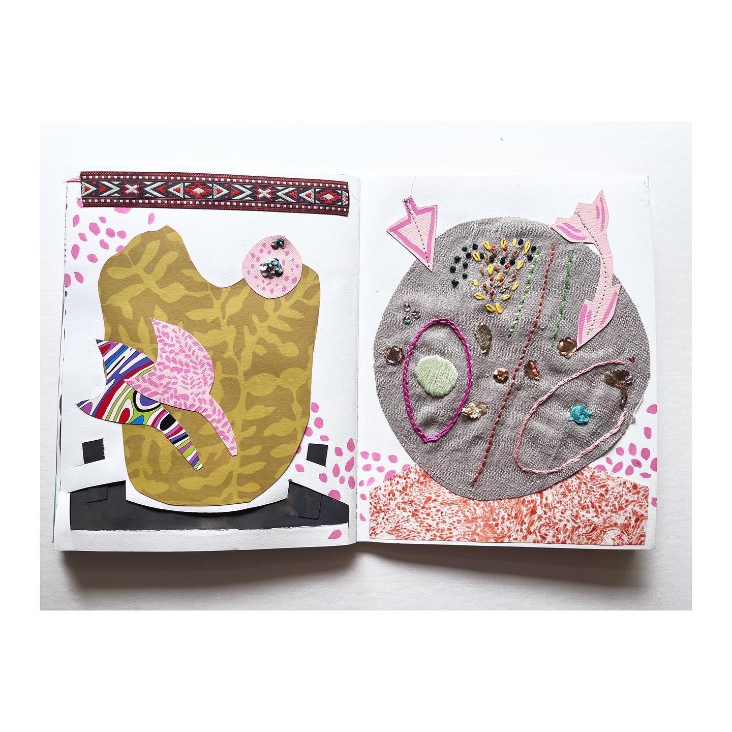
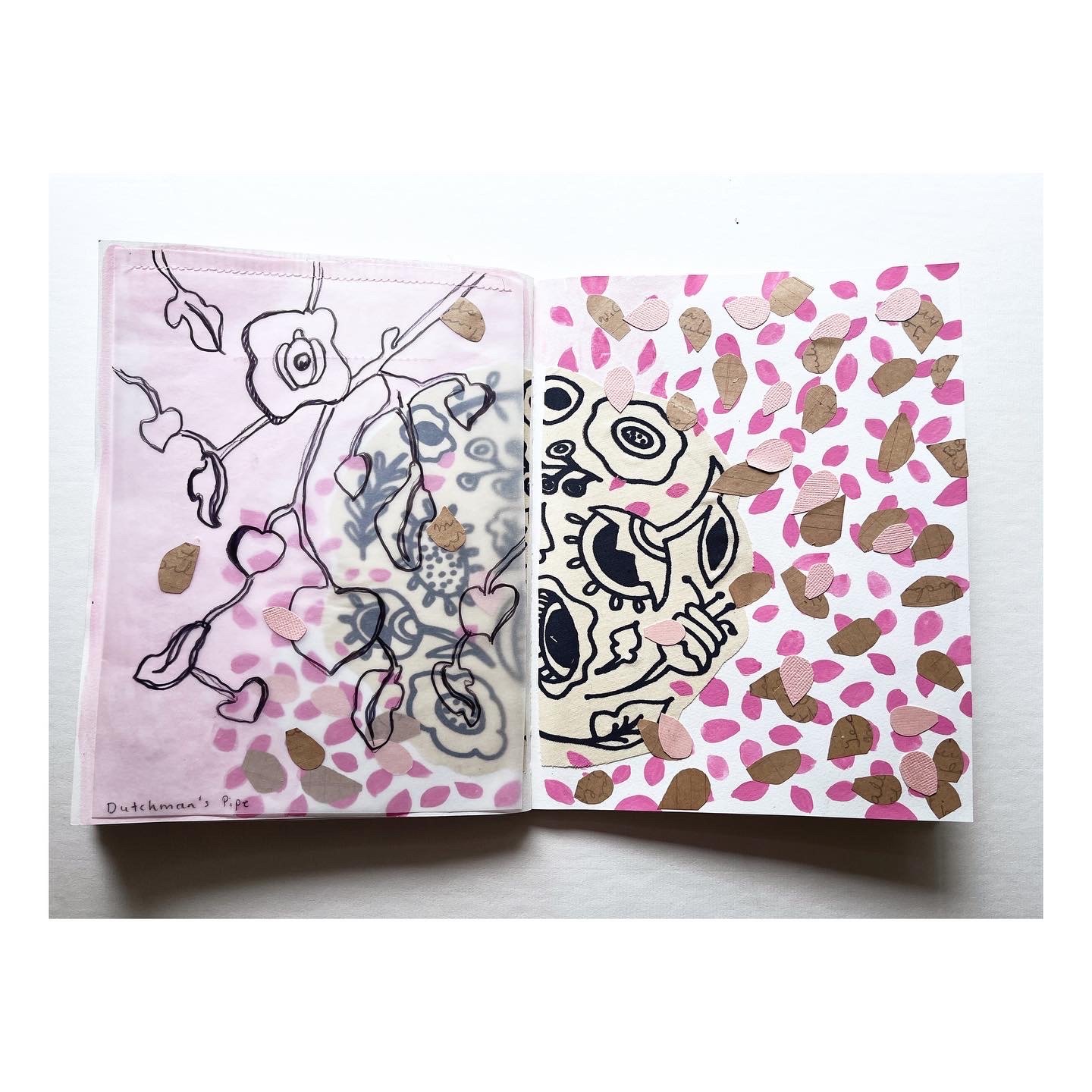
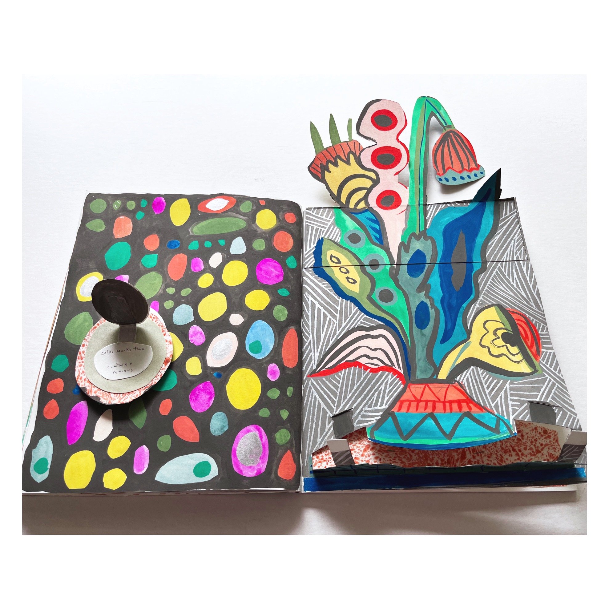
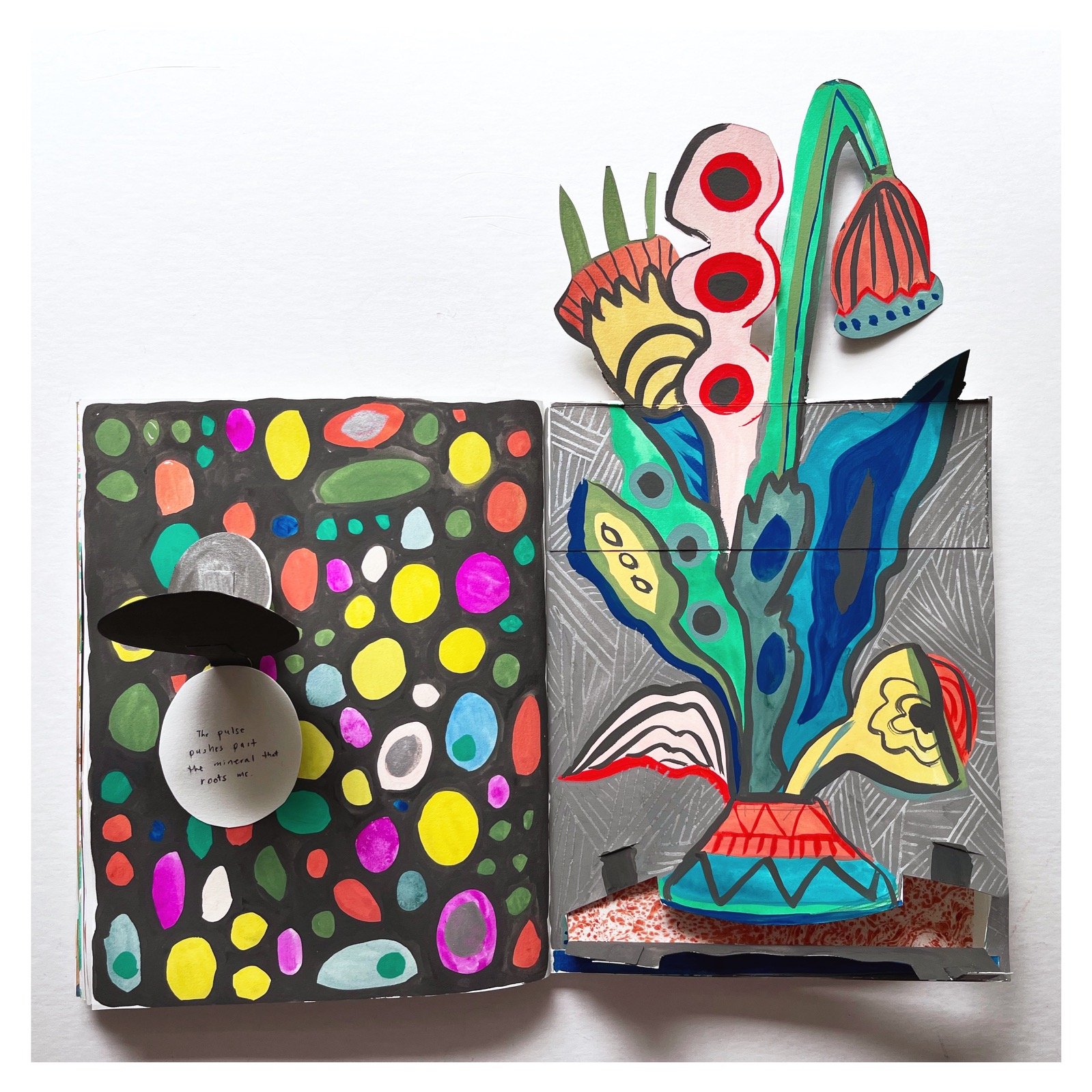
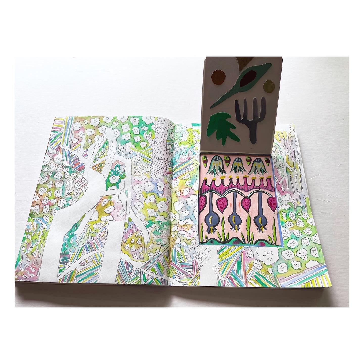
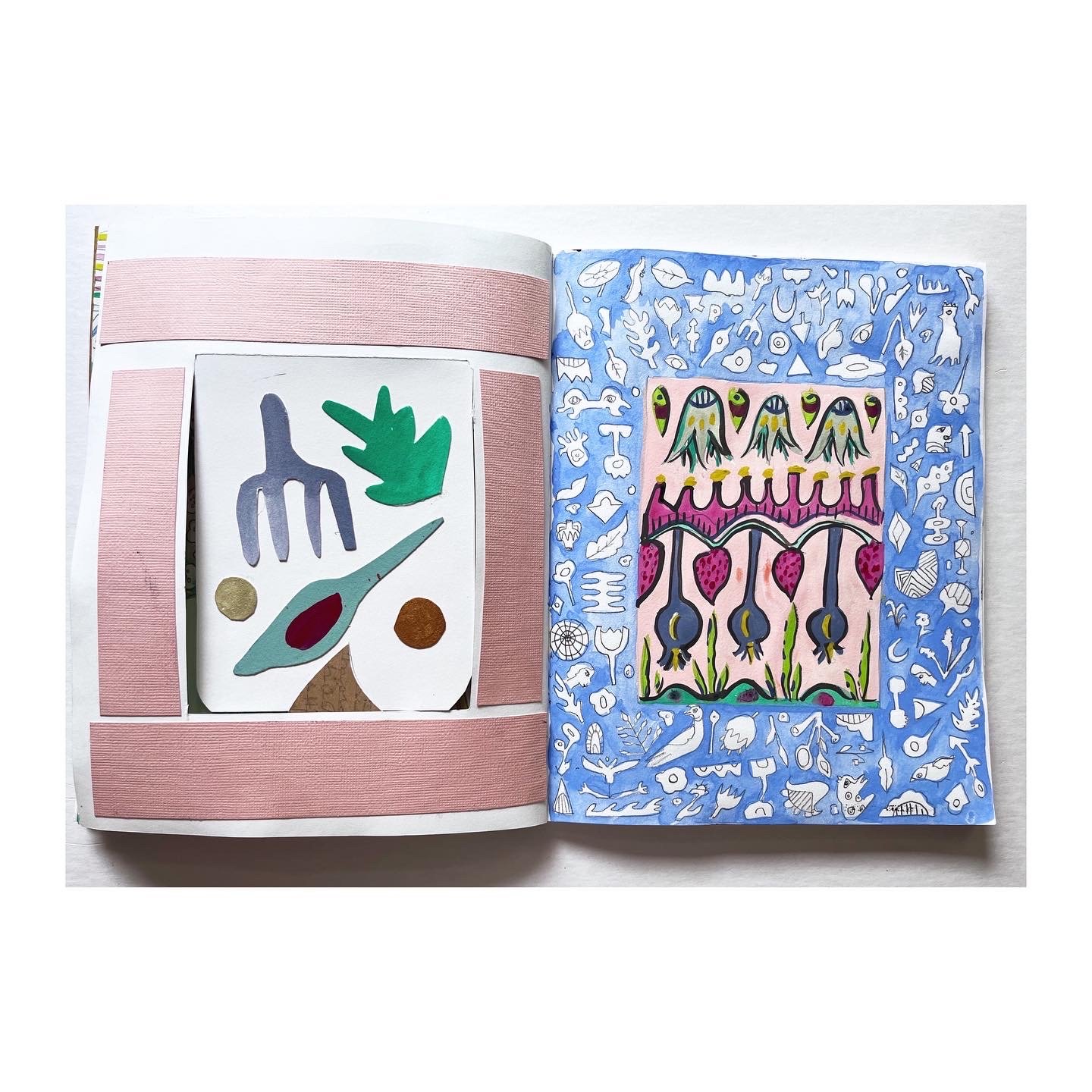
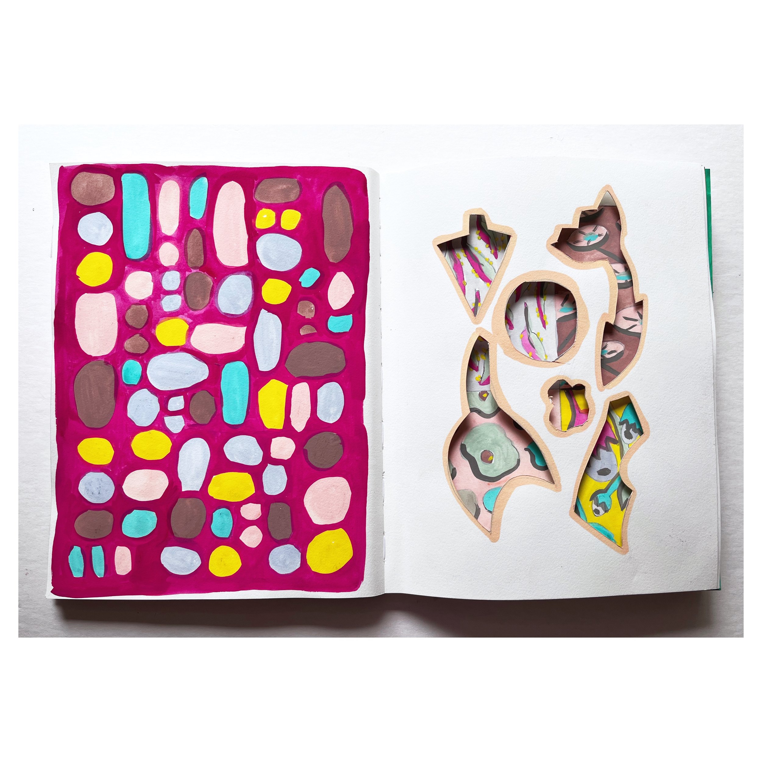
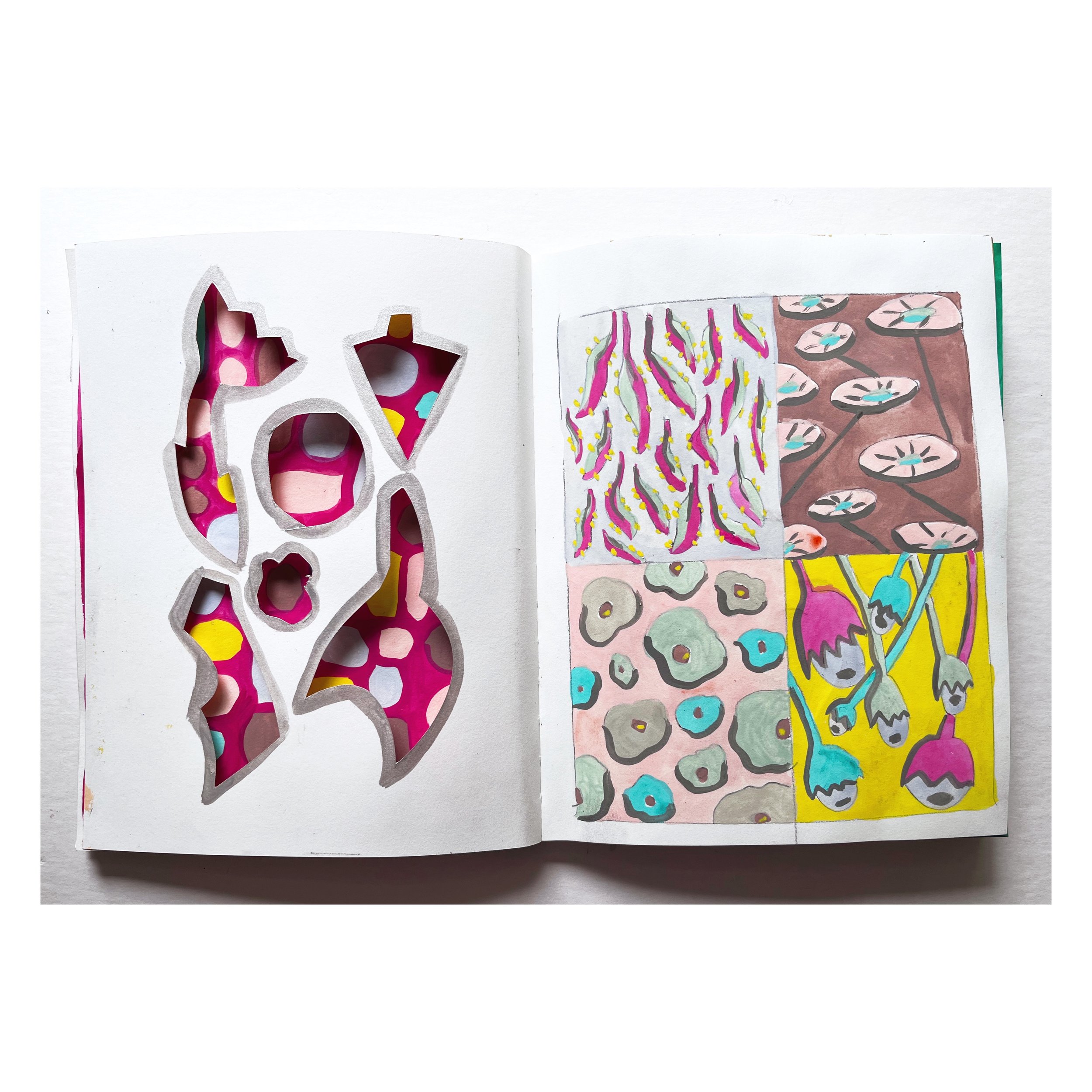
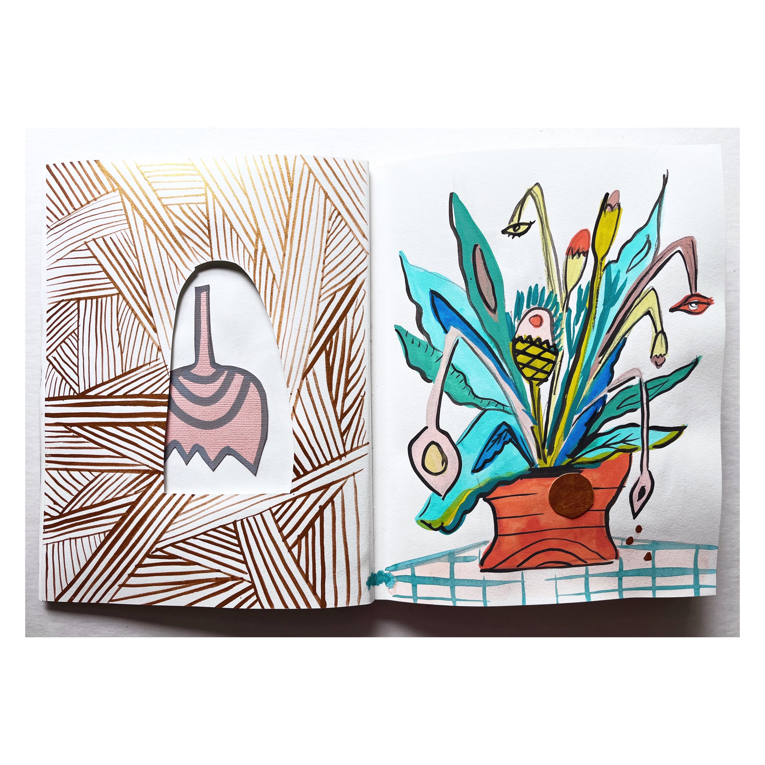
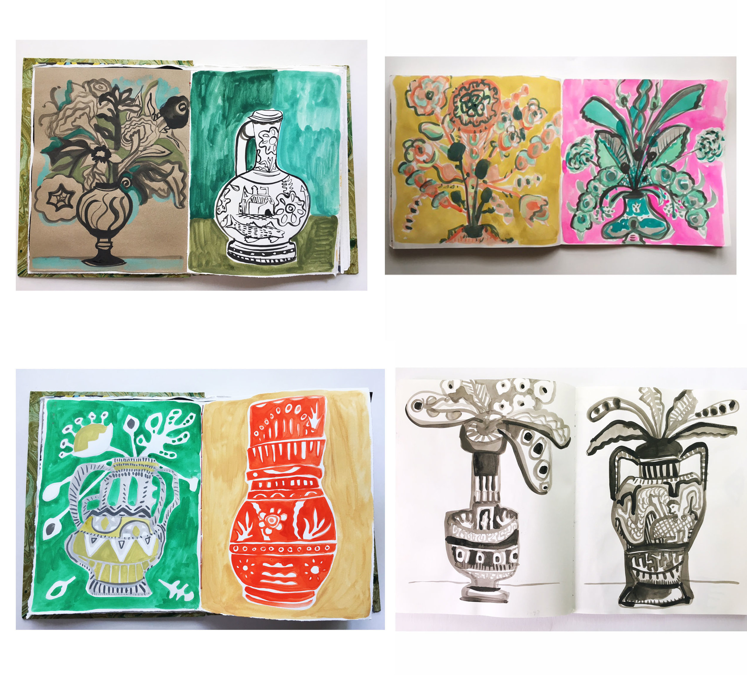
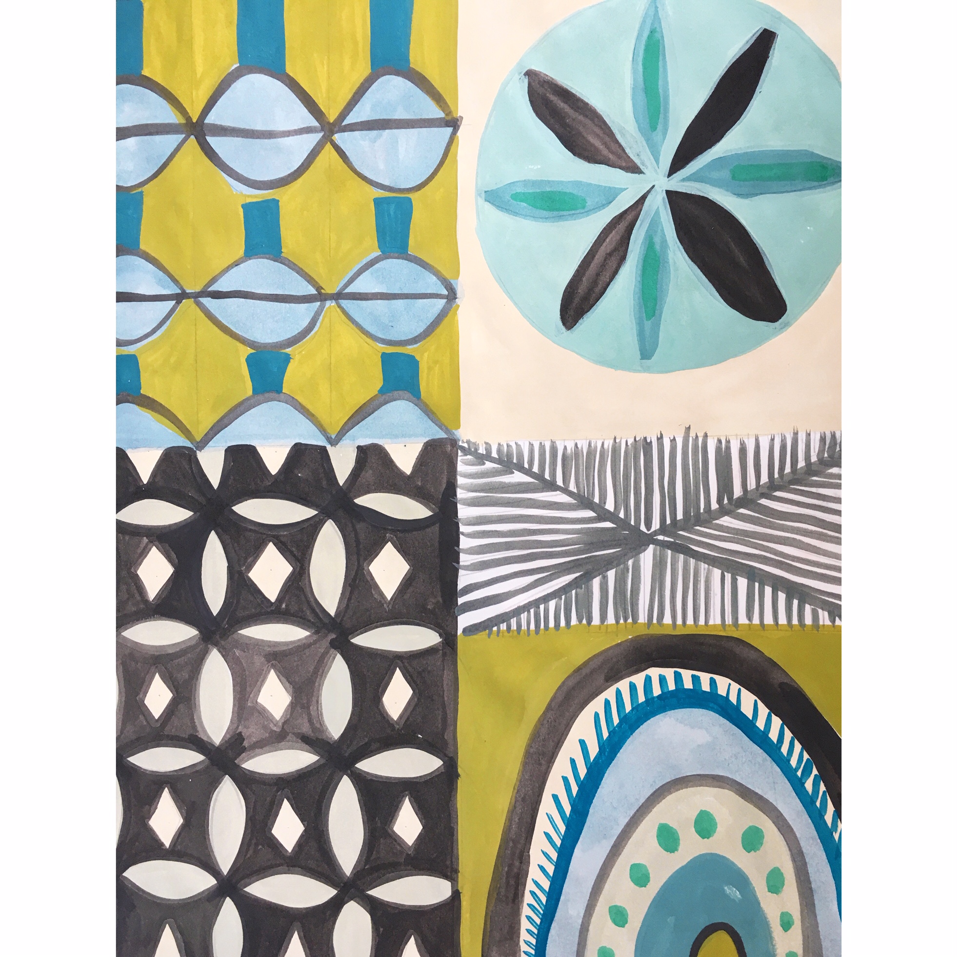
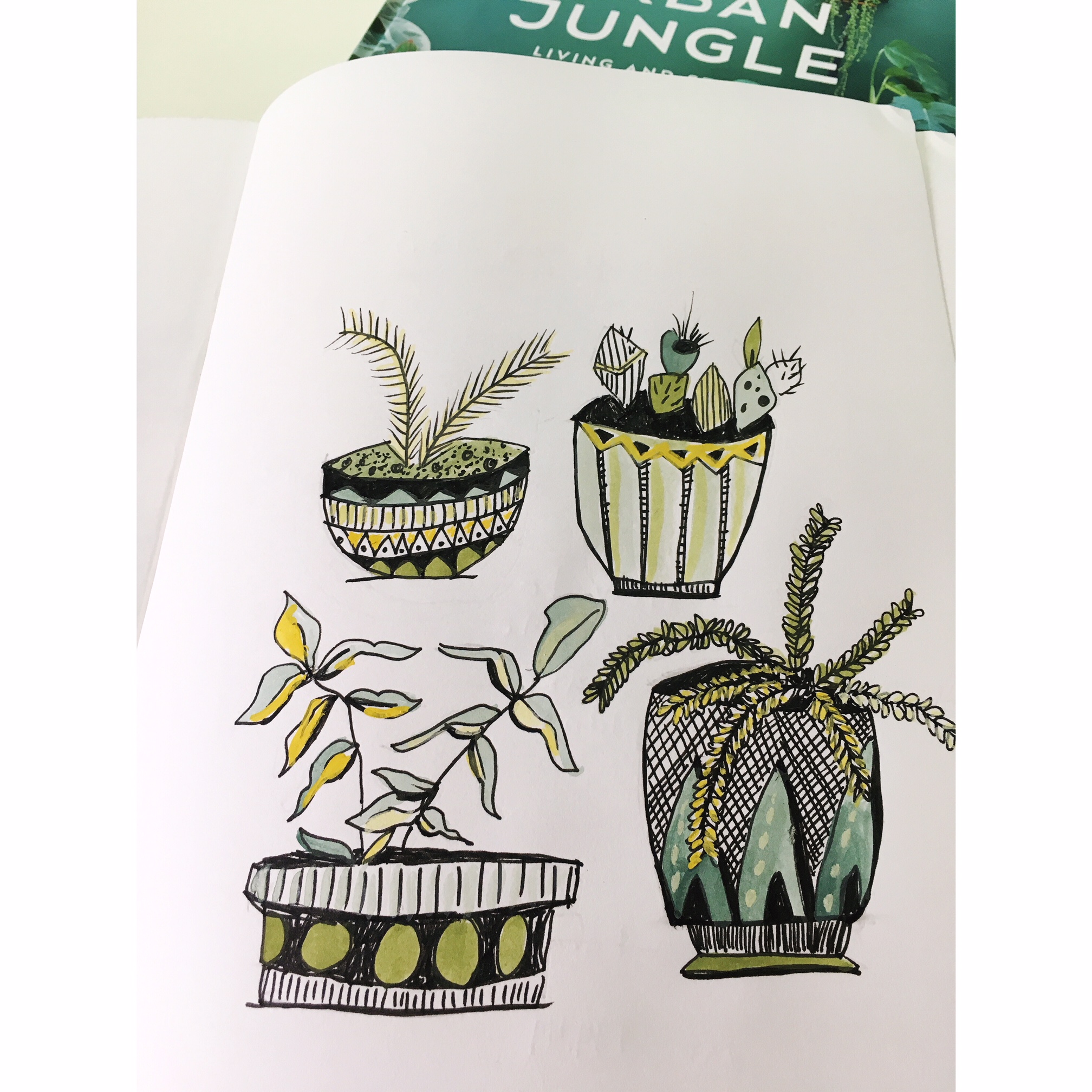
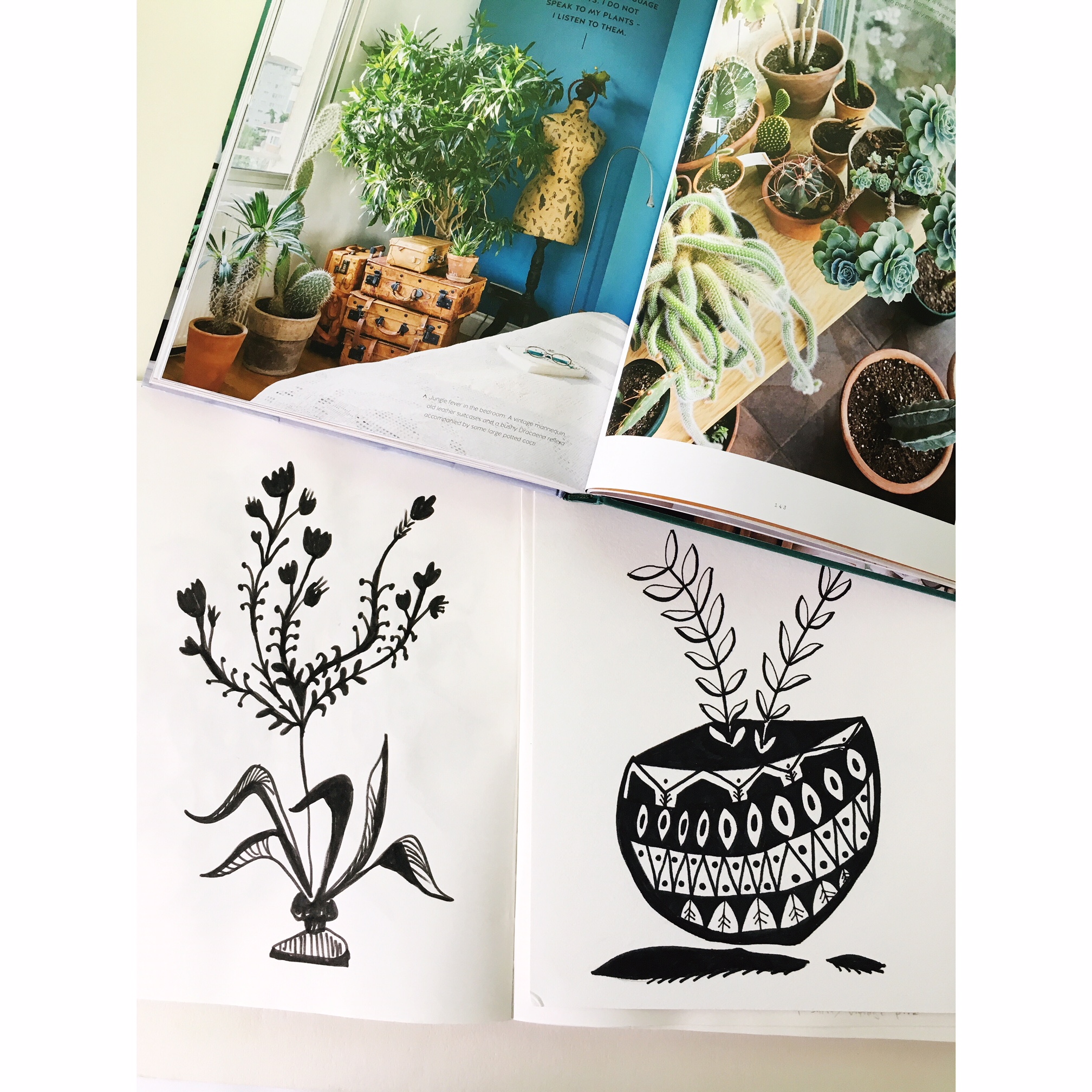
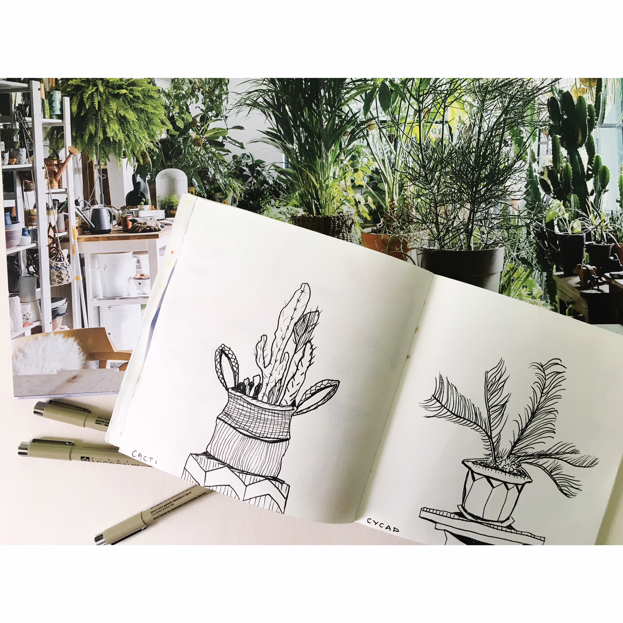
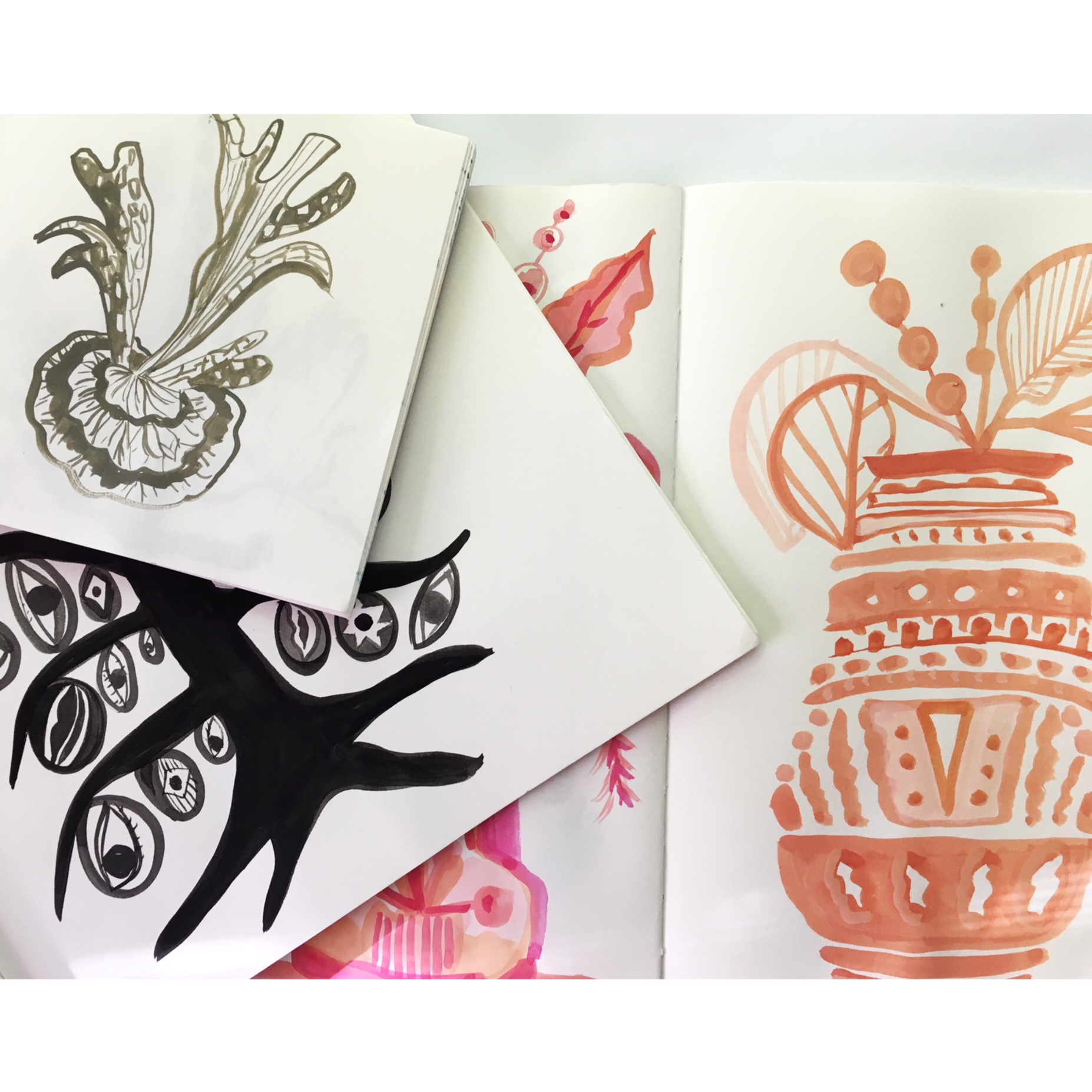
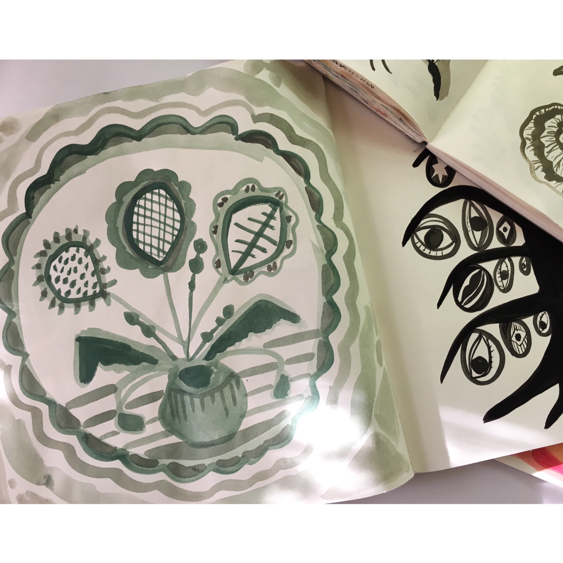
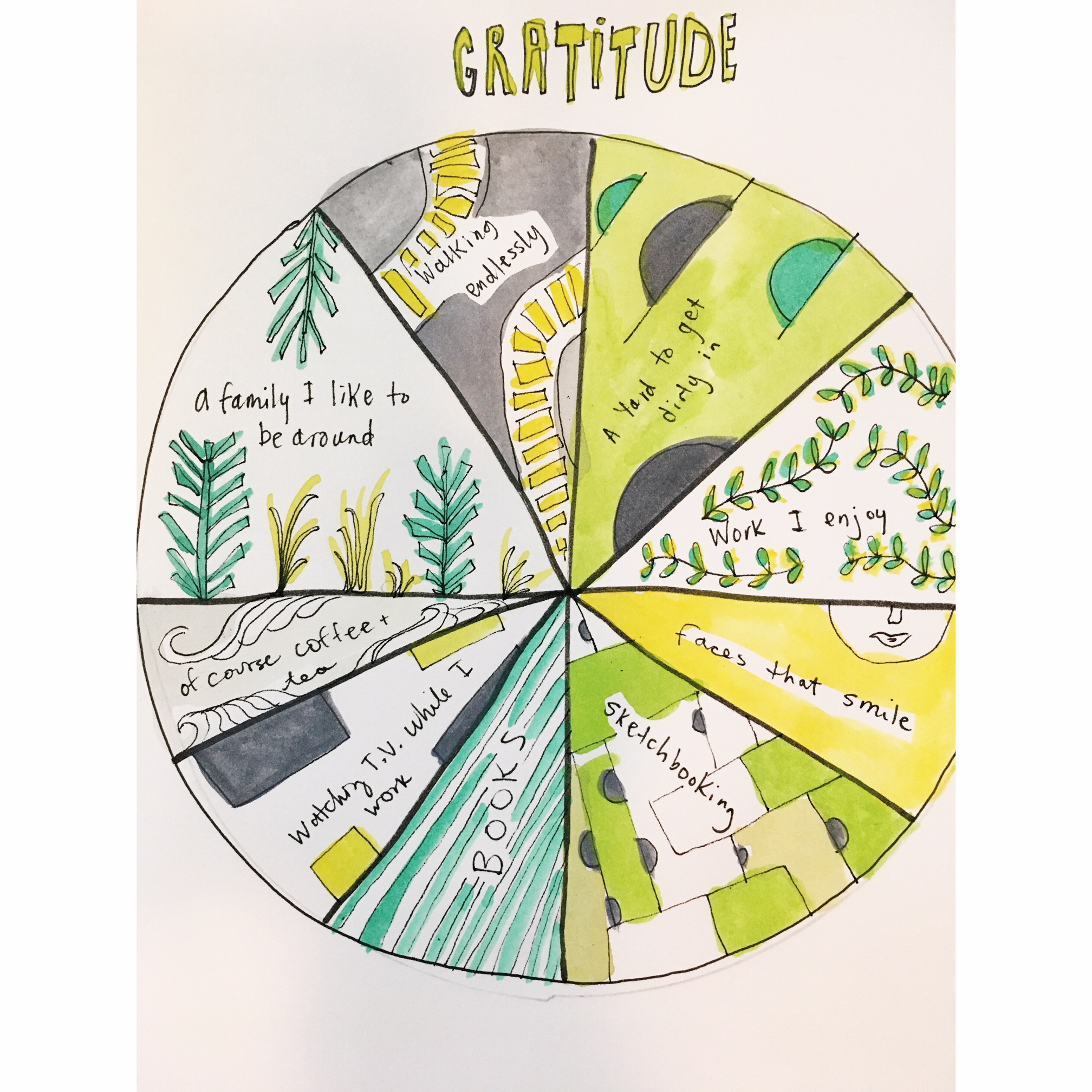
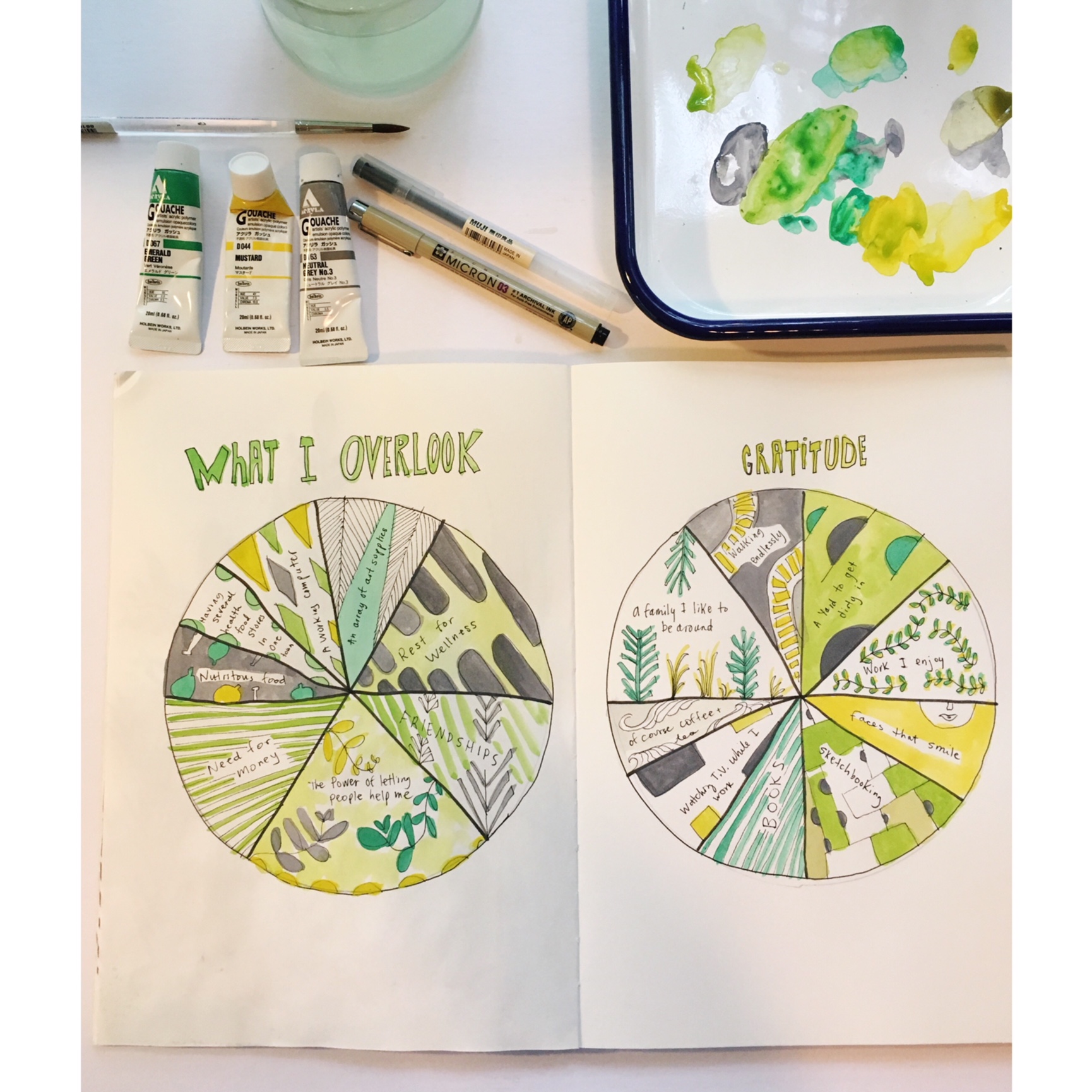
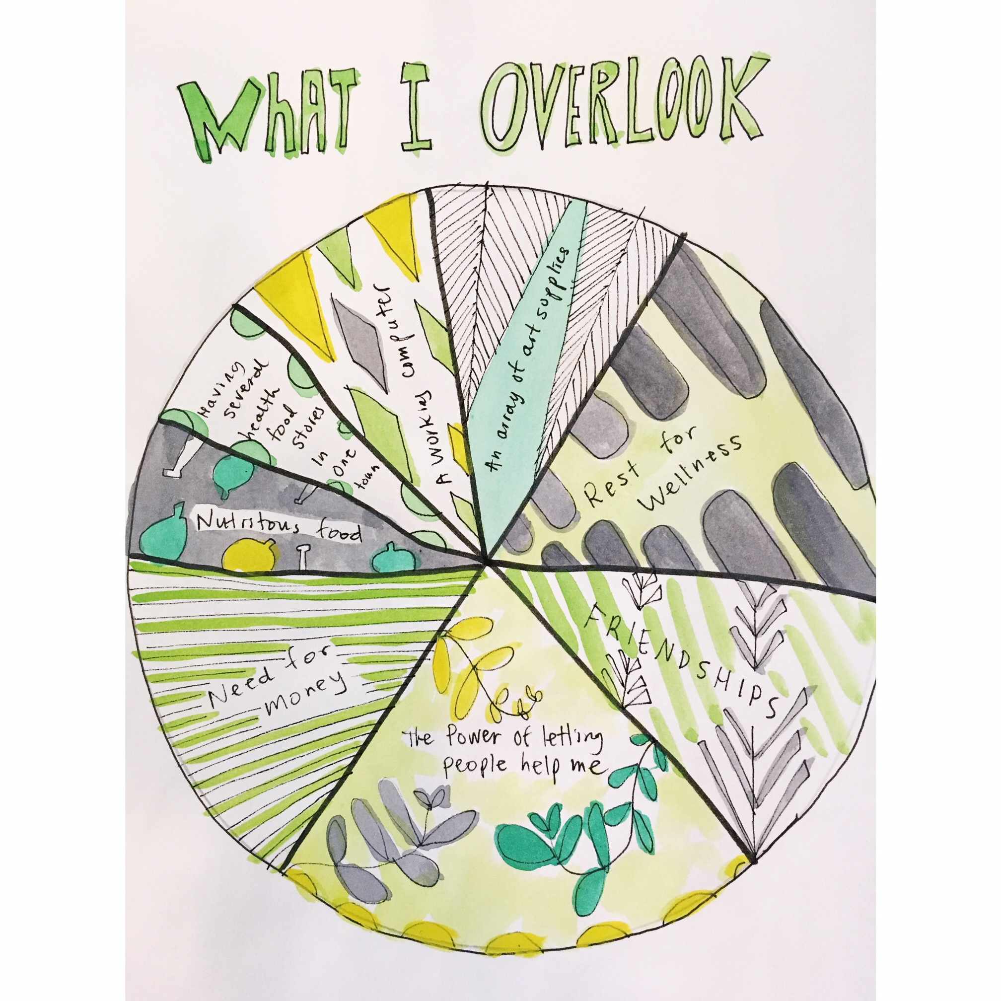
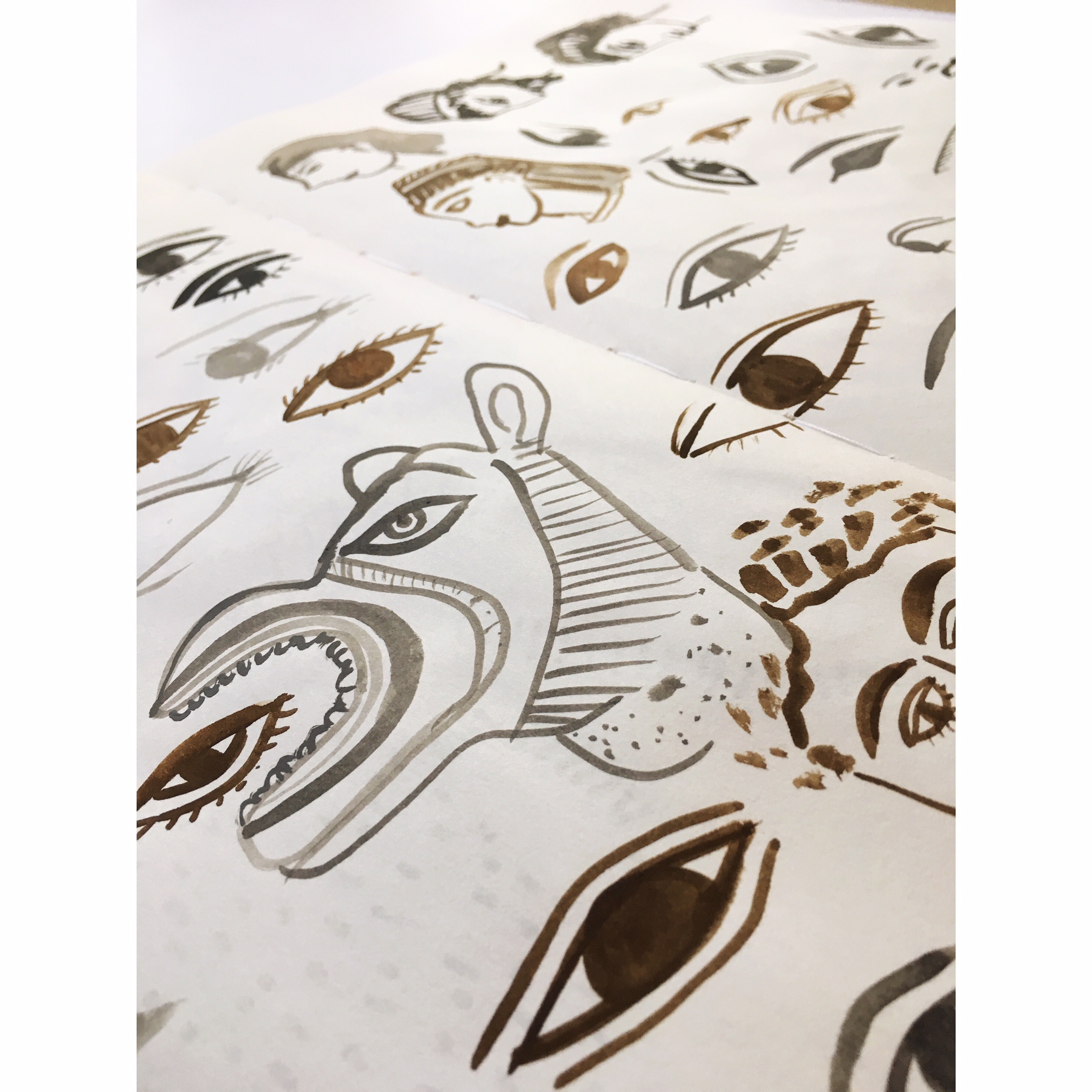
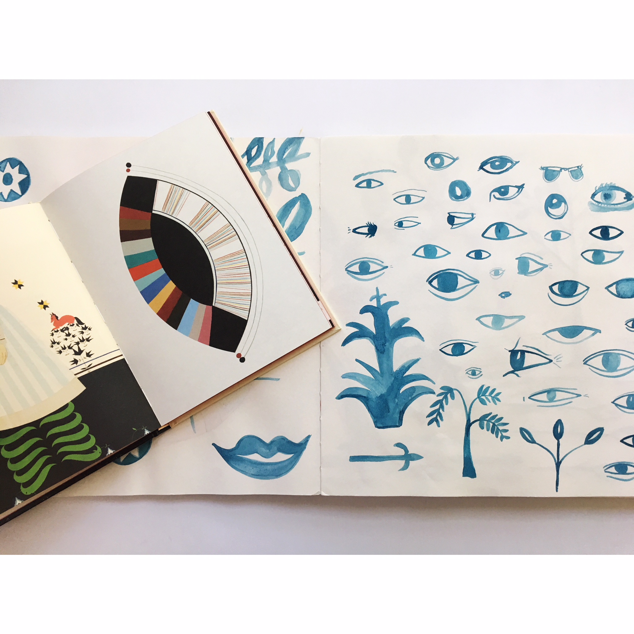
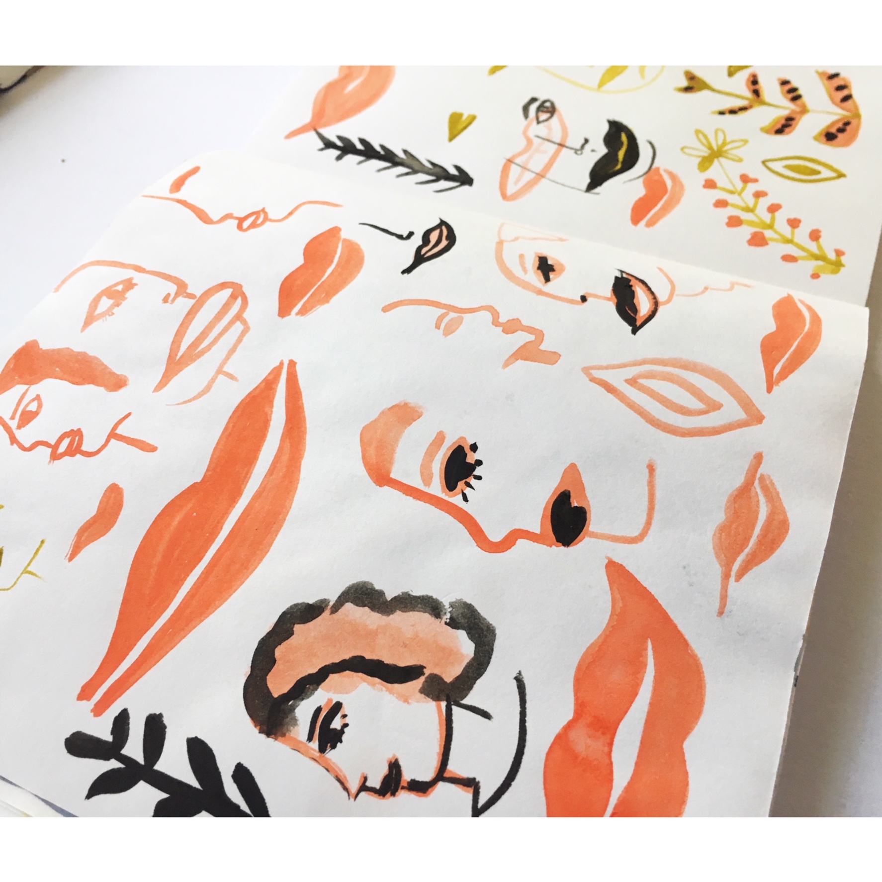
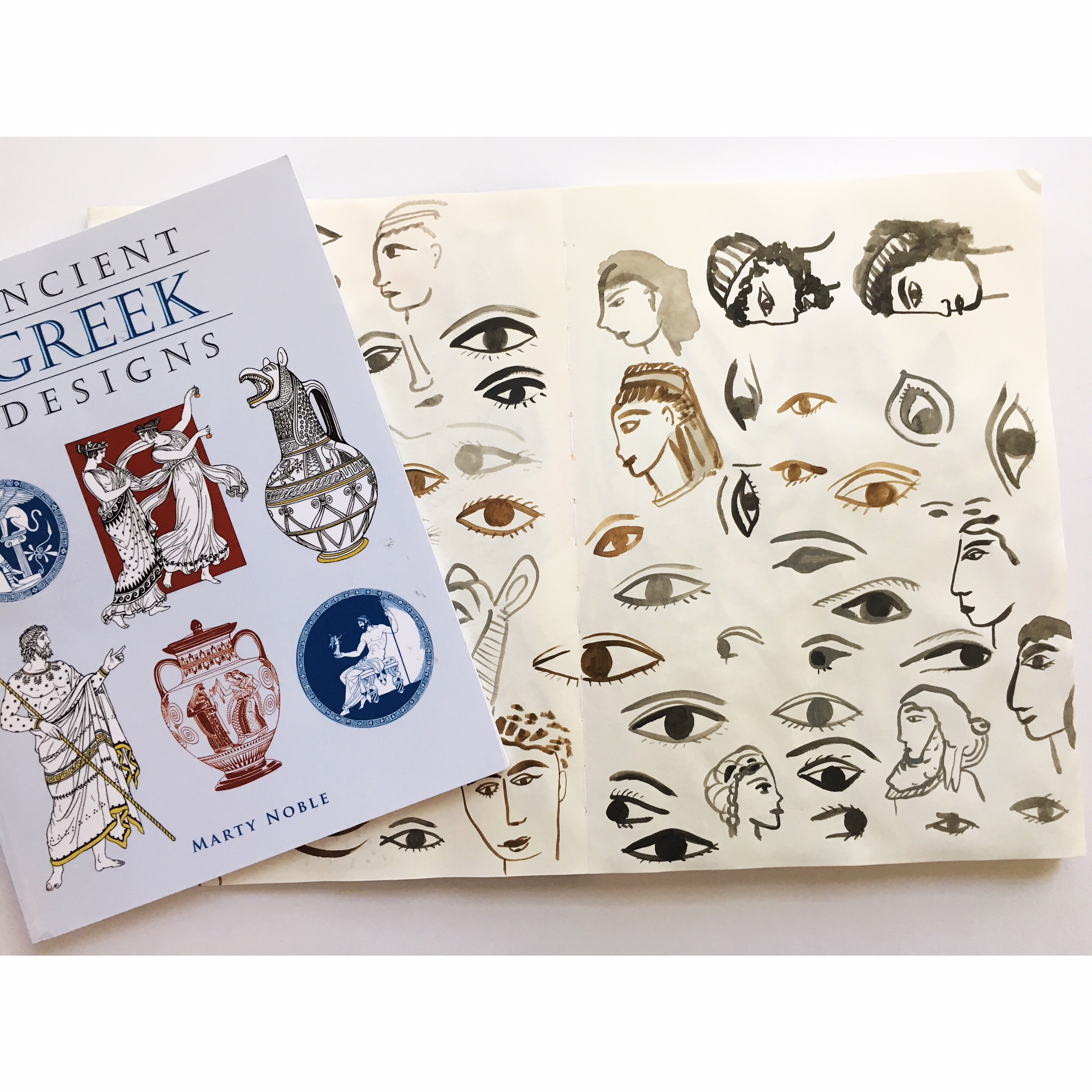
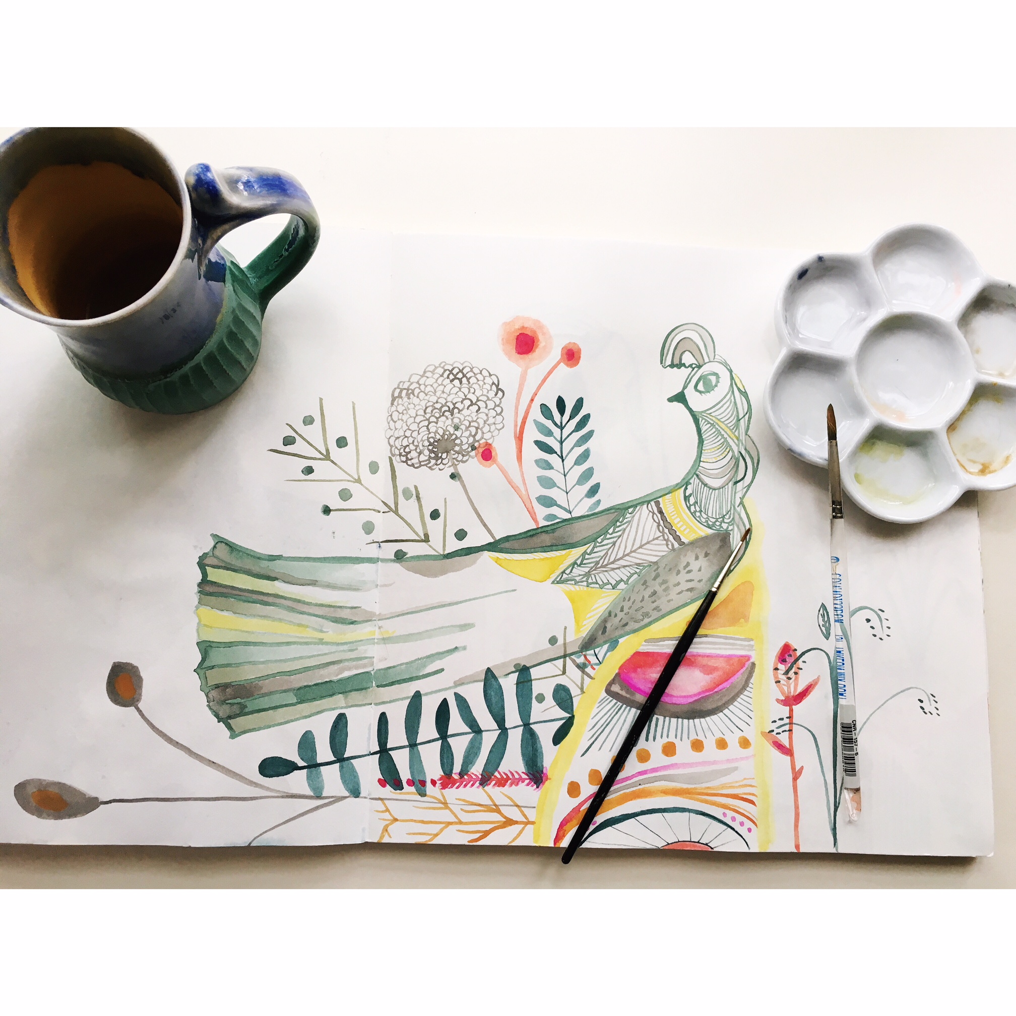
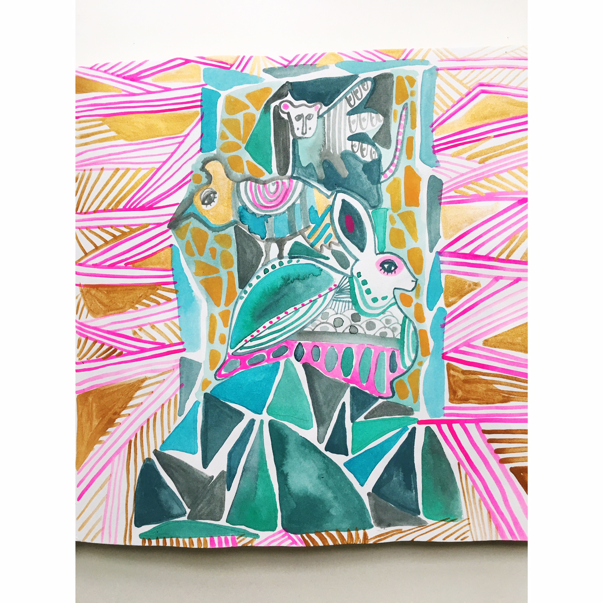
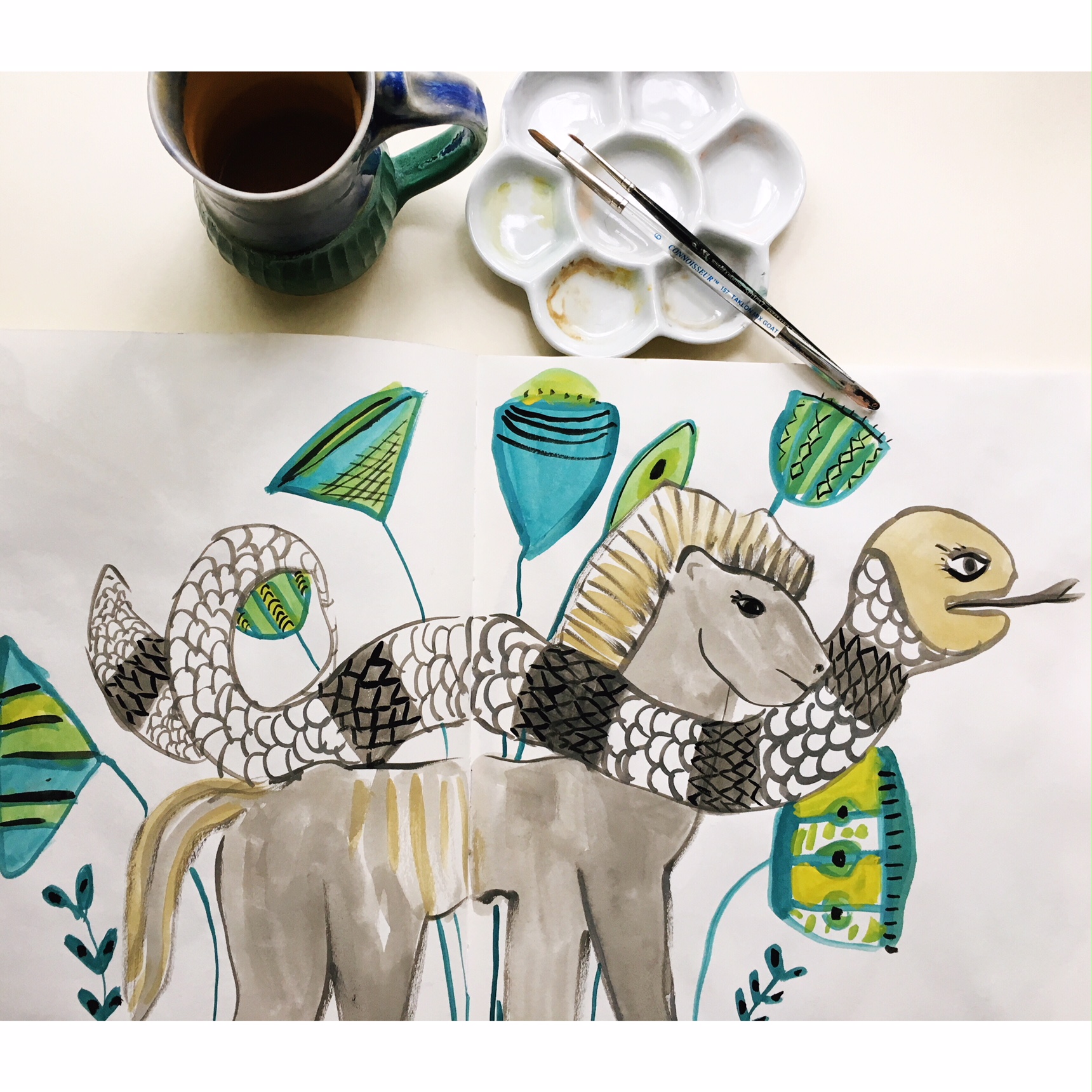
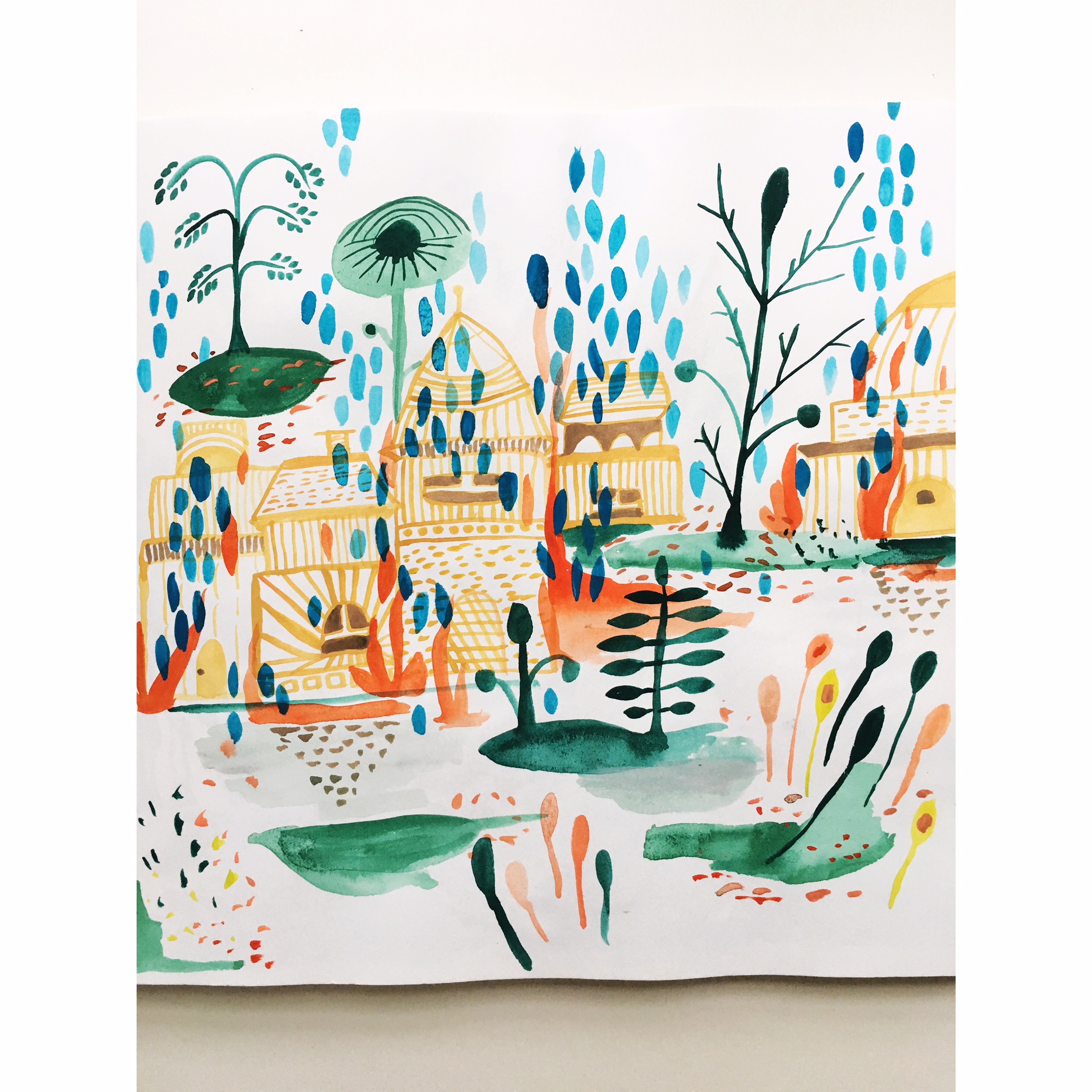
I love the idea of collecting something, probably my whole life I have yearned and looked to see what I wanted to keep, get to know more. I know there is a sweet story of me with full pockets of seashells where my pants were so heavy that my butt was showing. Or my mid 1980’s passion for stickers, my intense love of old bottles, or books, or patterns, or more books. I love things. And sometimes because of having so many interests in can be hard to organize them into what makes them more useful to me. Because I am curious and because I think everything can teach us something, I have to make a way to understand them. I think this can be aptly applied to your sketchbooks. Creating a taxonomy of images that you are drawn to is both fun and useful. It allows you to collect things you like, as in my case it is shapes, flowers, monsters, things that look natural, vases, bouquets, different line quality, color, negative space. I return to these themes again and again. And I’m always so surprised that when I think I have found a new shape, if I only look back it was already appearing in my pages.

Taxonomy is a scheme of classification. Collection is a group of things or people. What I think happens is at first I collect, I create groups. Then I realize they are related and there are reasons for these repeating images, even stories. I tend to have a separate sketchbook that I write in, but even if the ones that only contain images there are still stories I can see.

People often ask me how I developed my style, or How do they develop their own style. I think these are good questions and of course the most unhelpful but honest answer is time. But the one that I think has really pushed me is the rate at which I gather images to reference later. Perhaps it’s because I am continually surprised by what I make, not in terms of “wow, that is wonderful” but rather “huh, I didn’t know you were gonna do that”. And because of how unexpected I think I am being, my sketchbook reassures me that actually no, there is a thread.

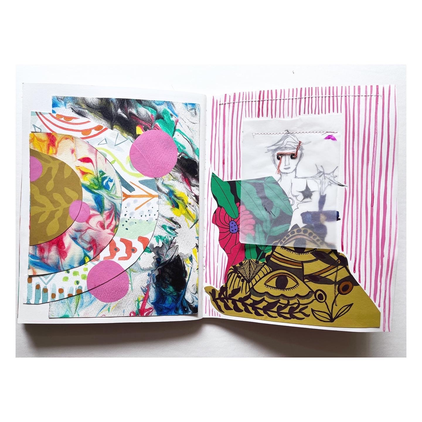
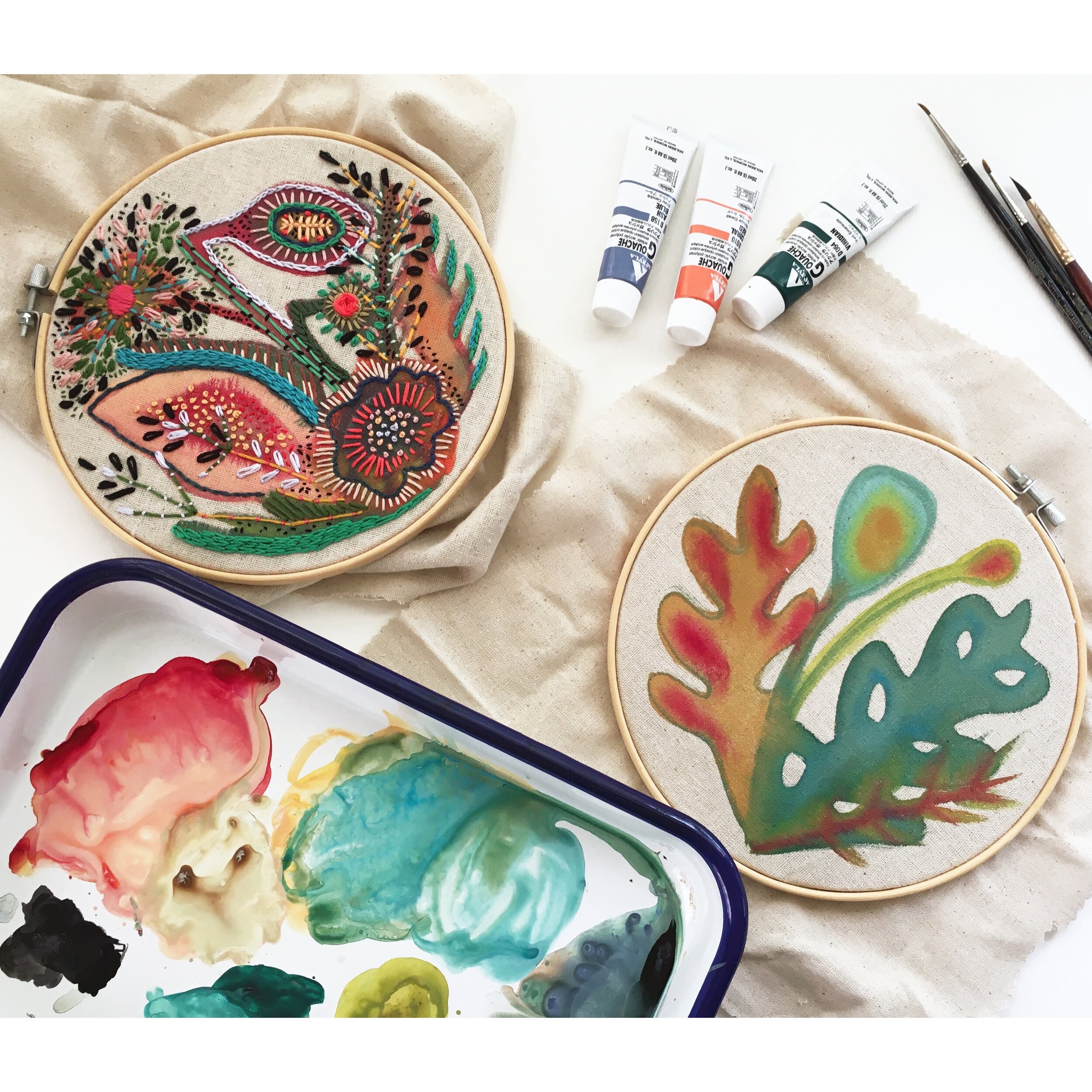
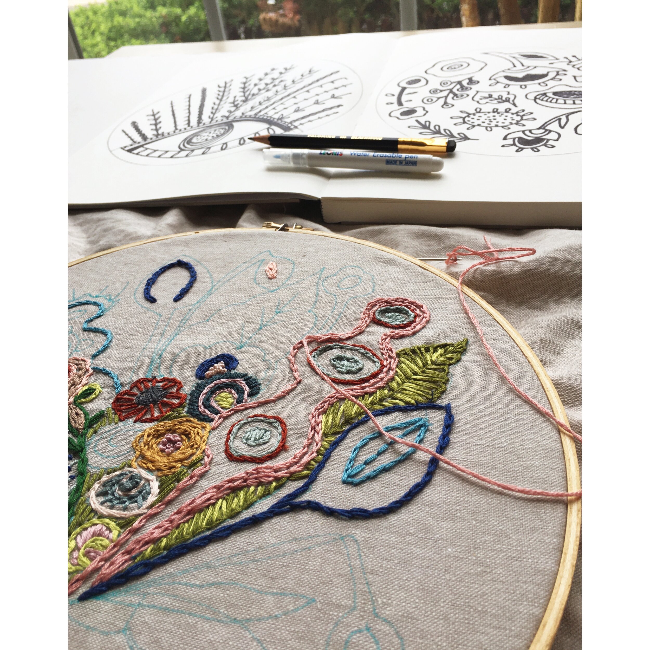
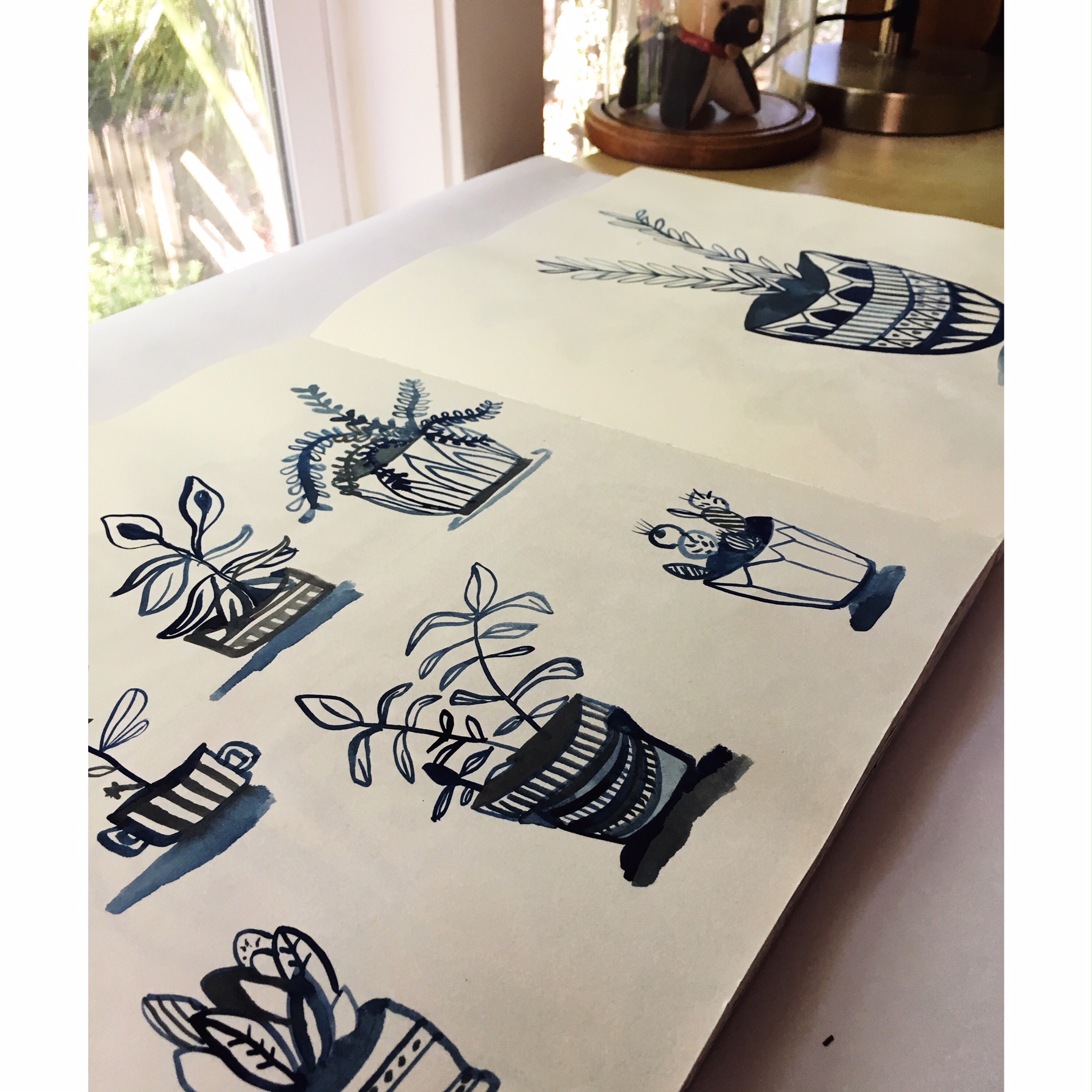
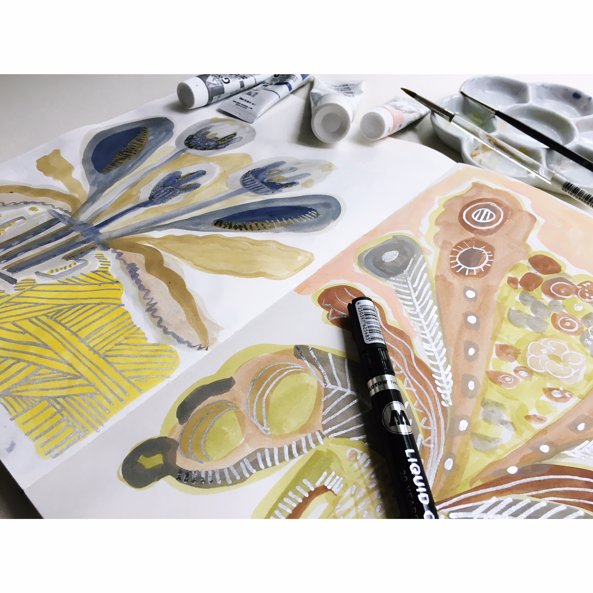
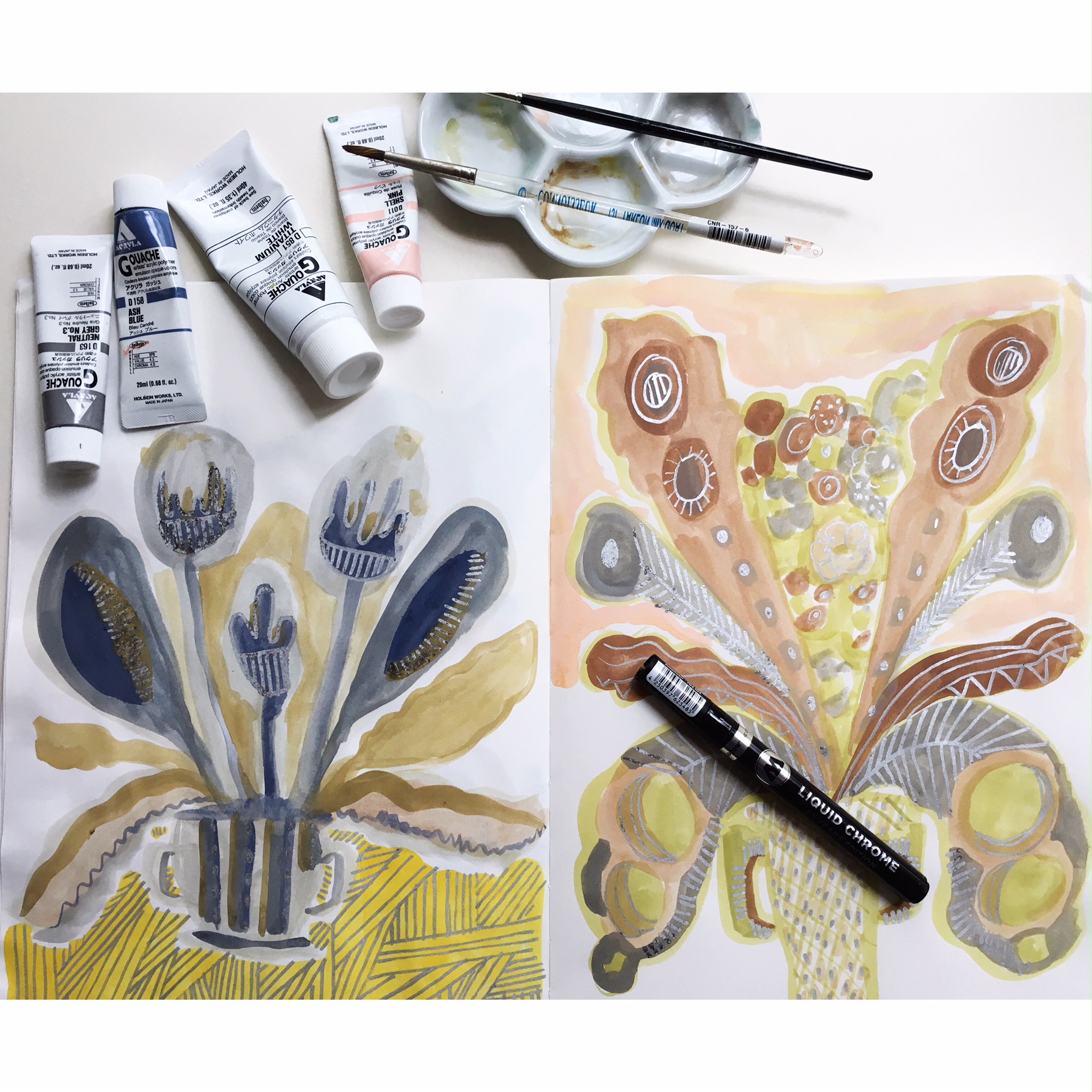
When I go to create things like larger paintings, ceramic pieces, items I might sell at a maker festival, I look to my pages to help me see what I could use. That way I am referencing things that are true to me. They might have started off at a different point. But when I go to carry on, I use them. What I mean when I say they started off at a different point is that I look at things first when I make some of the pages.

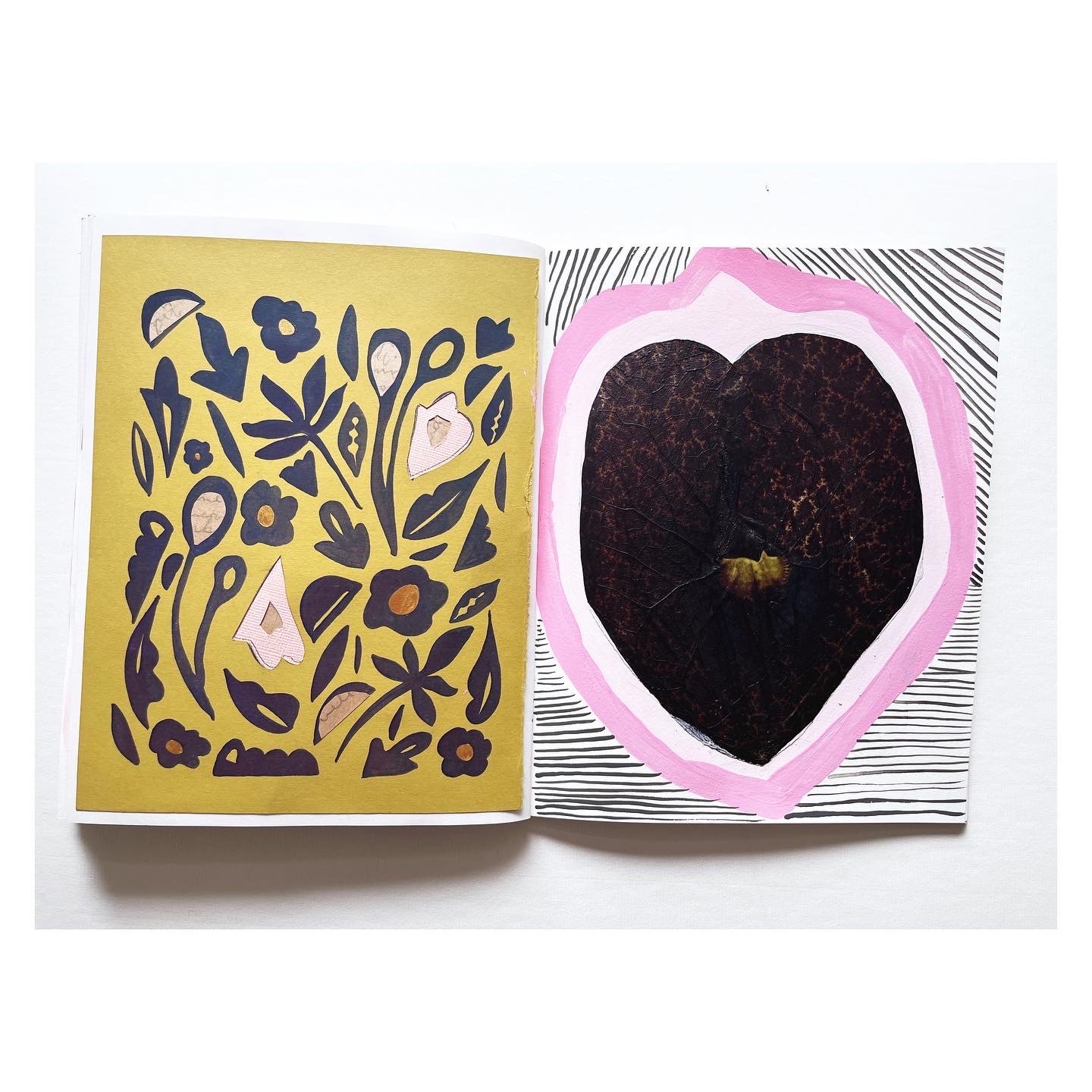
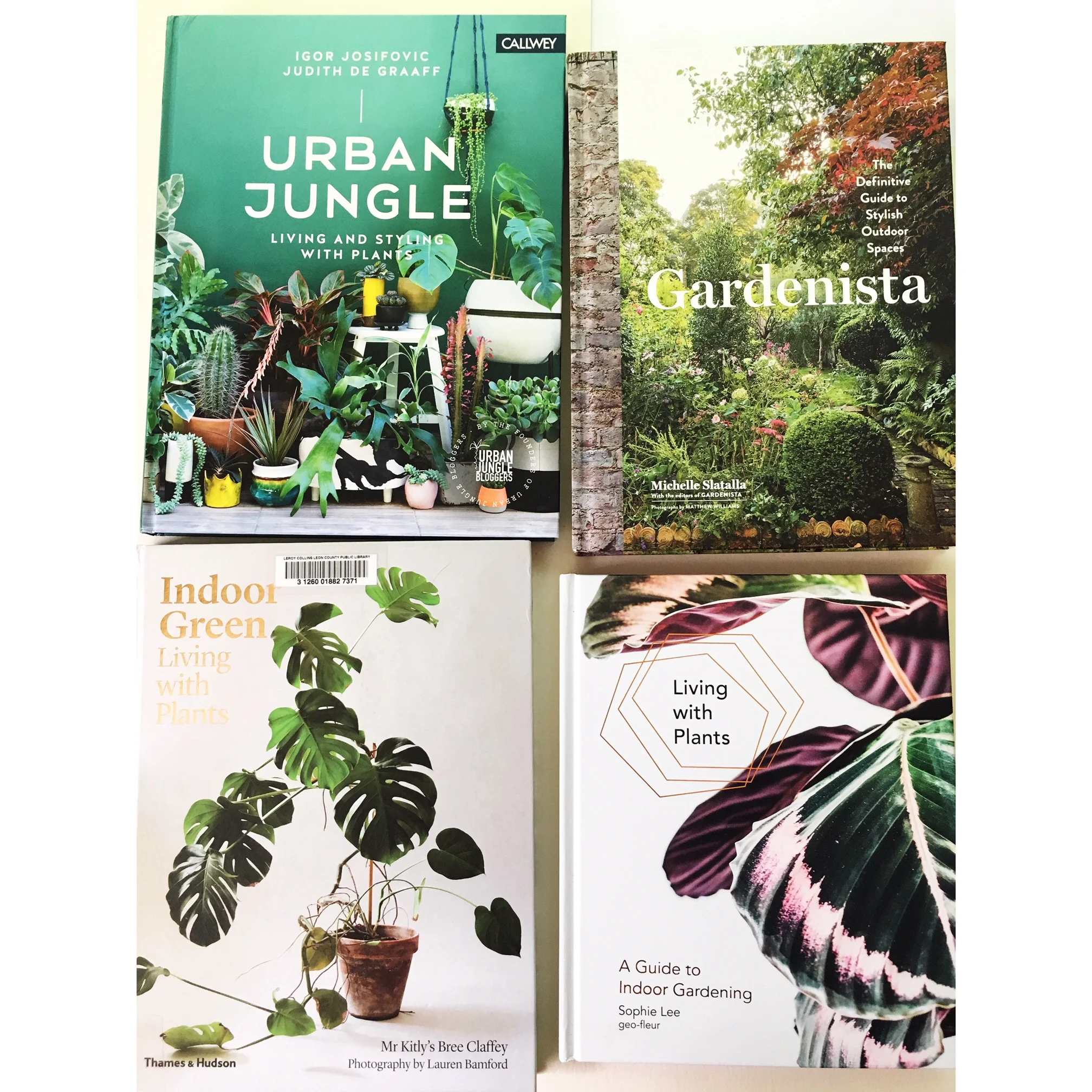
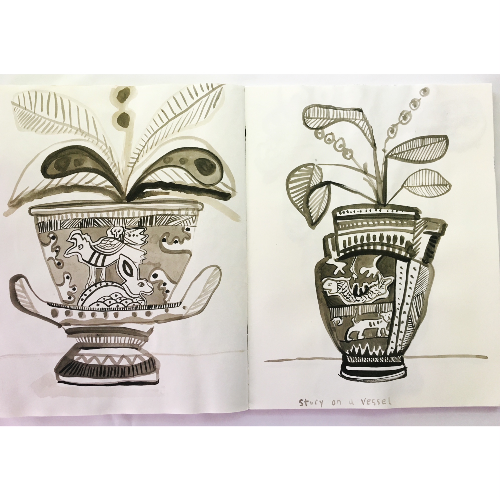
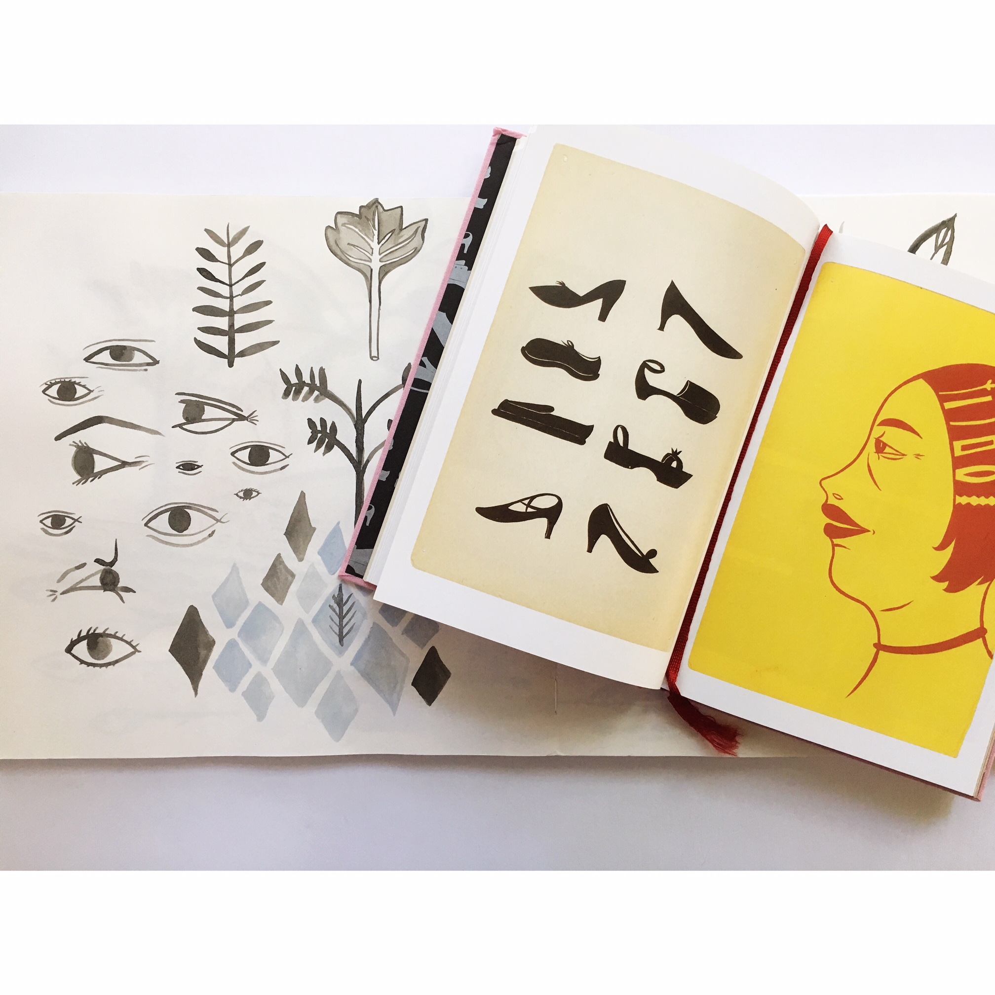
How I start several projects is with Dover Publications on the subject at hand. Because they are copyright friendly I never feel the worry that I am accidentally stepping on a infringement. I have a vast collection of patterns, vases, folk art, Greek Art, Egyptian designs. I also look at old embroidery books, 1970’s craft books and Japanese floral arranging. This give me a place to start and let loose. I recommend finding books that are on subjects you tend to get excited about. That way you can have a starting place.

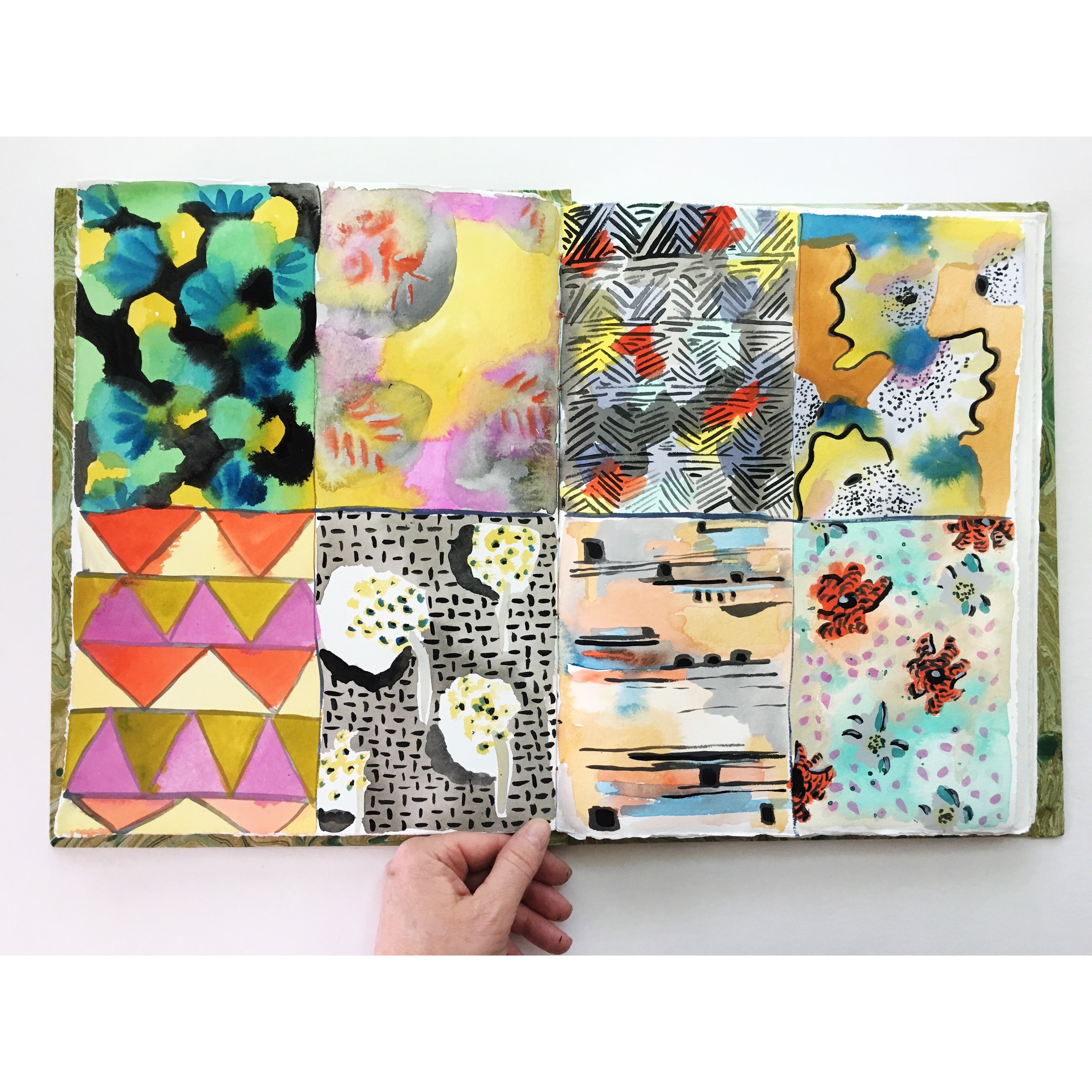
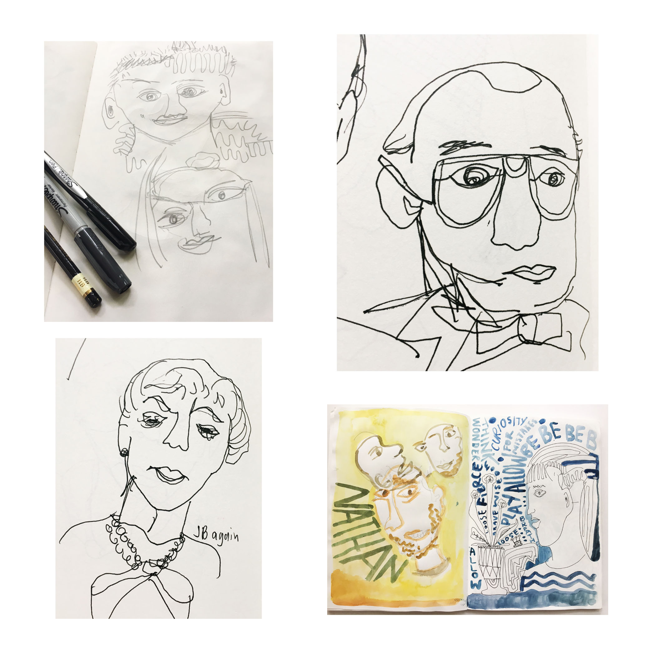
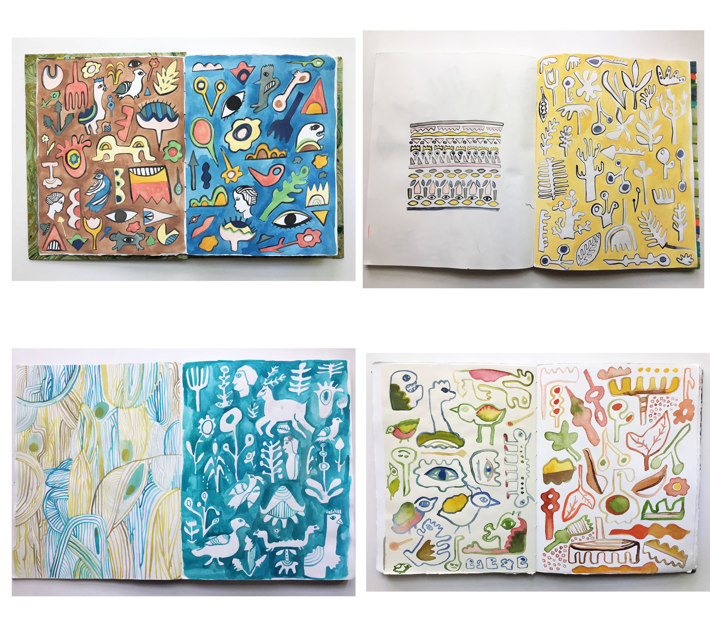
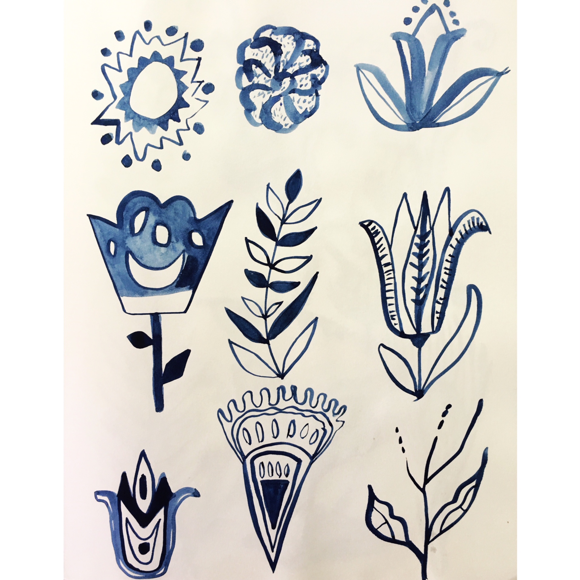
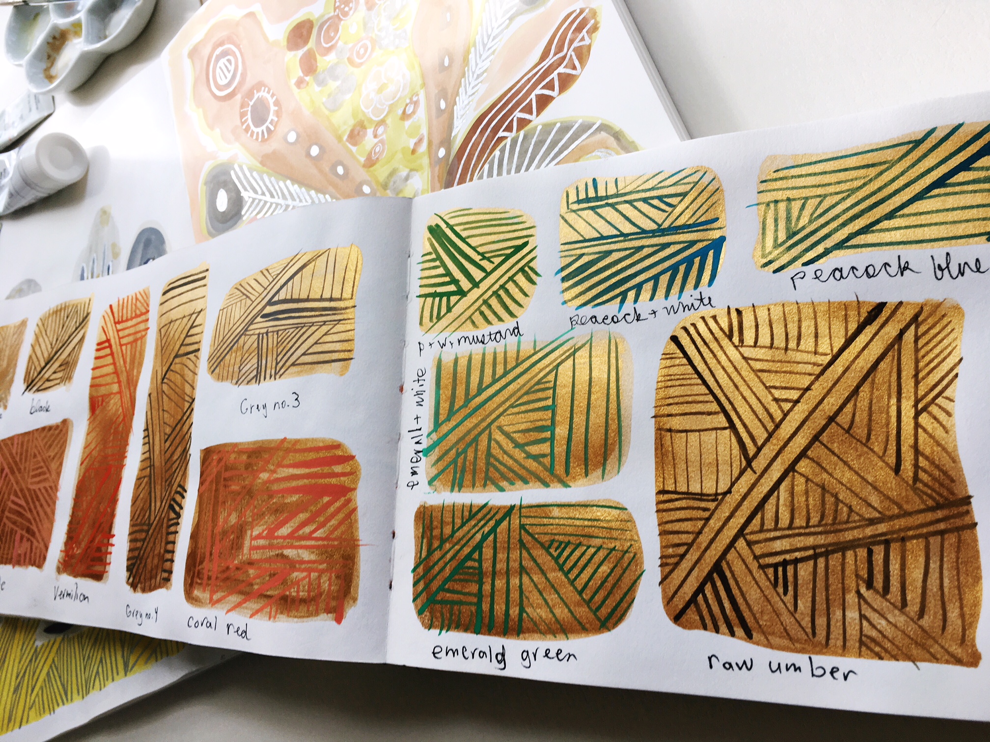
How to begin; What I would do is look through your sketchbook pages and see where you are building threads. What do you return to, why? Now, start with those and continue with them. Change your medium, try thicker brushes, smaller brushes, create outlines, work with pen, keep reinventing the way you build your images. See how just a small change can make a variation in that form. You are beginning to build a taxonomy of images. If you want you can write words to them, perhaps all the floral shapes reference to you strength, and all the leaf shapes represent fragility. Write that down, and just because you said it was that once doesn’t mean you cannot change your mind. Change your mind a thousand times if you like.

Now begin again, pick another shape, idea, reoccurring motif and go at it. And again, and again.

Of course, this is also how one develops a sense of style. You see that no matter the medium you play with or how you alter what you are doing it still looks like your own hand created it. And then you can see what you like and build on that. It’s a slow evolving process, but beautiful and rewarding.

Other artists to look at; Gregory Blacktock, Blackstock’s Collection., Marcel Dzama, Amy Cutler, Julie Mehretu

taxonomy of images.jpg

Sketchbook Prompt #10 - Collage

collage 4.JPG

Sketchbook Prompt #10 - Collage

Heading into collage can be very liberating and fun. It can also be paralyzing if the last time you entertained the idea of collage was when you were 11. I think there are a lot of ways you can become more comfortable using collage in your work. Let’s first talk about some things it doesn't have to be (but it of course, it can be if that’s your jam).

  1. Your composition doesn’t need to be filled corner to corner, I know we often see very intense solid packed planes of images. That is one way to approach collage, but you can also leave some breathing room in your composition. Think about the negative space that will be around the images, perhaps some of the paper showing is a good idea.

  2. The paper does not have to be torn, yes you can tear it. That can be liberating and a lot of fun. But you can also use scissors or an X-acto Knife to make clean cuts. I like the act of cutting with scissors but each person will find what they like best.

  3. There is the belief that your materials should match, or be store bought, or from old magazines. They do not! There are a lot of materials out in the world friends. Paintings you no longer like, old photos, book covers, marbled papers ( we will do a prompt on this during the summer), toned papers, postcards, vintage papers, old music sheets, tissue paper, handmade papers, old tea boxes. One thing I like to do is collect catalogs from stores I like the decor of. Often my color sensibilities are being stimulated and that becomes a perfect match for later collages. Go wild and let the fun of collecting begin.

  4. Yes, collage can be integrated with writing, painting, and drawing. Collage does not have to be isolated to just cut paper. Bring in other media, yes please. How much fun is it to put a wash down, paint a pattern and then collage on top.

collage supplies.JPG

Materials I suggest;

  • Bone folder, one either made from bone or teflon. You will use the bone folder to help get out the air bubbles. Air bubbles may be the number 1 distraction in collage and they don’t have to happen. The bone folder is great for small areas. Added plus it’s great for future bookmaking projects.

  • Brayer, a brayer will help you smooth out the paper to eliminate air bubbles. Great for larger pieces of paper. I think the brayer will help you achieve a seamless collage to paper presentation. Often a brayer is used in printmaking, but it’s also a collagists best friend.

  • scissors, all types. From surgical scissors to Fiskars. Whatever helps you get the perfect cut. You can also use X-acto knives they come in all fancy ways now for every type of need out there.

  • Glue, I recommend Yes Paste or Coccoina glue for most of you daily collage needs. If you have really heavy paper or photos you might also want to use PVA glue. It will dry faster and help get the images down. Yes paste and coccina are a paste and that is to your benefit since there will be less air bubbles. That is really your biggest villain in collage. If you use a cheap glue stick or Elmer’s glue you will get frustrated. It’s the glue not you, so invest in some good glue so that your work will shine.

  • glue brushes, it really is a big deal. A regular paint brush ain’t going to cut it. Having the right tools is essential to whatever task is at hand. I recommend a nylon glue brush like the one here at Dick Blick.

  • Old phone book or magazine. This is perfect for when you need to put glue on the back of your image. You do not want to get your table or art covered in extra glue. Open up the old phone book, lay down your image, put glue on it pick it up and put it where it belongs then either use the brayer or bone folder to adhere it to the page. Voila! perfect clean collage technique. Now flip the phone book for your next page so you don’t accidentally get old glue on the face of your next collage piece.

  • Sketchbook!

collage 1.JPG
collage 3.JPG
collage 5.JPG
collage 6.JPG

Sketchbook Prompt #9 - The value of sketchbooking

lost landscape sb.JPG

Sketchbook Prompt #9 - The value of sketchbooking

How do we place value on the things in our life. Often, we have to weigh our options due to time. We ask the question “will this thing I want be the best use of my time?”. I do believe time is our most valuable resource. Time with our family, friends, our work, our community, our pets, garden, and hopefully ourself. Usually the self is the one that gets overlooked. This is common and unfortunate because without feeling nourished it is hard to be our best selves.

With that said, it seems easy to not spend time in a sketchbook. It is just one step toward a final process, why not just get to the big painting, or artist book or t-shirt design, or poem. Why spend that “valuable” time on the process. I thought this for a very very long time. However, it all changed once I allowed for my valuable time to take place in the sketchbook. My work flourished and so did I. I have more ideas, more ways of being free, more places to look back to when I am not sure what I want to make. When I don’t feel good or have anxiety, I go to my sketchbook and make work. It is a bit of a cure all for me, it distracts me, guides me, reminds me, intrigues me, inspires me.

I decided that it mattered, my art mattered, and I mattered. I wanted to have a library of work that would be a journey of my artistic life. One that could be easily accessed, loose papers always disappear even when I am most careful. The sketchbook is also wonderful to share. I teach at FSU and some of the most fun is to look through each others sketchbooks, to see what that other person is playing with. Be it content, ideas, materials, shapes, patterns, people. We are curious about the lives of others and this happens in the sketchbook.

Time in your sketchbook doesn’t have to take long. It can be once a week, several times a week, you may ignore it for a bit and then binge on it like a good bag of chips. Allow your relationship to be varied, it’s ok not to use it everyday. Decide how it fits best into your rhythms. I tend to make the most art over the Summer. This is where I have the most time and ideas just build up in me. I start to really fill the books up. But even when times are slow, I sometimes carry my sketchbook with me so I can make small drawings that might take 20 minutes. I’m always amazed how much time I spend waiting around and really I’d rather create than mindlessly flip through social media.

Setting your Intention -

  • Set your intention in the back of the book. This might changes every time you use start a new sketchbook. The idea is that the intention set will remind you and guide you to what you are seeking from the practice of using your sketchbook. This also helps to set forth why you are doing it in the first place. In the past, I have said “using a bigger brush, use both pages to create a larger spread, work with text and image, create patterns, think about images that could be used on clay”

Materials -

  • There are a lot of sketchbooks out there. I adore Kunst and Papier binder board sketchbooks. But they are not always the easiest to find. I appreciate the varied sizes and how the paper seems to hold whatever I use on it. Here is one at ARTMATERIALSONLINE. Or for a different option Moleskin square sketchbooks are also excellent. If I didn’t have a handmade book or my beloved Kunst and Papier ones I would definitely use Strathmore 500 series mixed media softcover.

  • Supplies to create with. Of course anything is great, a no. 2 pencil, your favorite pen or that shared box of crayons that you have been carrying since you were 8. The most important thing is to create. However, I cannot say enough how good supplies enhance the work and often we value something more when we have the proper tools for the job. Here are my top picks to start off. Micron Pens multipack.

  • Brushes, of course there are a lot out there to try and fall in love with. I think these are a great economical version by Utrecht, lots of sizes so be sure to get a couple different so you can play with the variations. Windsor Newton Series 7 is what a lot of folks love. I have a couple of them and do really like them.

  • To make it easy on yourself it’s great to get a travel pack of watercolors so you can use it anywhere. For $12 this is unbeatable by Winsor Newton. This is the one I use when I am out and about. Watercolor will be more transparent. You can also pick up these brushes by Pentel that hold water so you don’t even need to have water with you.

  • There are different ideas out there about Gouache and what brand to use. I think they are all great but beware that there are different varieties for a reason. I use Acryla gouache, these are very matte and are not reworkable. They lean more toward Acrylic paint but are smoother. Once you put down the paint in your tray and it dries, it can not be worked again. However, Winsor Newton gouache can be worked well after you squirted your paint out. So you can mix colors walk away for hours and reuse that color again. This is a major perk.

  • Colored pencils can be a lot of fun and again, there are a lot of choices. My top 2 would be Prismacolor which is available all over even Costco or Caran d’Ache for beautiful lightfast waterproof colored pencils. There whole line of pencils is wonderful.

Go forth and explore!

Working out in the world, a blanket and 2 sketchbooks so I can work in the other one when one dries.

Working out in the world, a blanket and 2 sketchbooks so I can work in the other one when one dries.

intention was to play with more patterns and to create a page that complimented and contrasted at the same time.

intention was to play with more patterns and to create a page that complimented and contrasted at the same time.

The intention set here was to work on the horizon, the book opens is 22” long and 11” tall.

The intention set here was to work on the horizon, the book opens is 22” long and 11” tall.

Sketchbook Prompt #8 - Repeating an image over and over

sb warm.JPG

Sketchbook Prompt #8 - Repeating an image over and over

I know this might sound redundant doing something over and over. But I’m pretty sure this is how we get good at things. Thinking back at how children learn, they have to tie their shoes so many times before it’s instinctual. Playing an instrument takes time and commitment, and you have to do it over and over. I also do this in my work. This is how my thinking goes, I am curious about plants, vases, and bouquets therefore I will draw/paint them endlessly to see what will come of this relationship. I will learn how I see them, how I want to change them, how I want to continue to be with them. I will only learn about them if I spend time with them. This is a lot like a relationship, a good relationship takes care and commitment. So does making art.

The question to ask yourself is what are you curious about? Food, clothing, traveling to new places, hiking, vintage books? You may not be able to answer this in one thought. You may need to go out and look around, see what you keep scrolling to on Instagram or finding yourself day dreaming about.

Once you find the thing you feel most curious about right now, draw/paint it. Our curiosity’s change, I know mine do. So be sure to allow yourself to move onto other things too. Make it abstract, make it look naturalist, try drawing it photorealistic. Think about words that describe it, draw those. Play with font and make a page that is only text. Paint it in different colors, paint it upside down, paint it using a big loose brush, paint it using a tiny brush.

The idea is to try and look at it as many different ways possible. You will see new things that you missed before. You will create your own collection of drawing/paintings that show your relationship with that special thing. The longer you stay with this curiosity the more it will evolve. I recommend at least 20 different pages. But that may seem like too much, so be sure to make it approachable.

Materials;

  • sketchbook! Here are some suggestions of beautiful ones; Kunst and Papier, Moleskin watercolor sketchbook, Strathmore series 500 mixed media paper.

  • Drawing and painting tools

  • then different painting and drawing tools, remember you want to add variety to these pages.

sb stark.JPG
sketchbook blue.JPG
sb studies.JPG
sketchbook for new banner.JPG

Sketchbook Prompt #7 - Pattern Play

sb pattern 5.JPG

Sketchbook Prompt #7 - Pattern Play

If you are familiar with me and my work, then you probably know how much I love patterns. I have been fascinated with patterns for most of my life, I would say for at least 25 years I have been studying them. When I go to my sketchbook and decide to draw or paint patterns I usually reference something at first. This gives me a starting off point. I may pick up a blanket that has a great weave and study it, or a recent magazine showing off new Moroccan tiles, I look at old patterns from all over the world; you can find them in books or via a google search. A lot of times I photograph things I see so that I can look at them later. The important thing is to be aware that patterns are everywhere. When you start to notice and collect them in a matter of speaking you will have your own array to draw from.

One of the reasons I like to draw/paint patterns is that I reference them later to go into other works. I often include patterns in my larger paintings, or in a product design, but sometimes I just enjoy how freeing they feel.

You can either devote an entire page to a pattern, or divide your sketchbook page into sections and fill those in with different patterns. In those sections you can make different patterns, with different colors or similar and see how they work next to each other.

Creating patterns can be a great place to play with different color palettes. I adore color and am always looking to see what happens when you place the colors next to each other but in a different environment. Consider your primary colors; Red, Blue, Yellow and then look to your complimentary colors. The complimentary colors really love each other. You have Red and green, Blue and orange and Yellow and purple. These colors really grab your attention. So think about how you can pair colors in that range and see what happens.

Perhaps you are trying to evoke a mood, and you are wanting something warm. Play with colors in the red,orange, pink family. If they feel to bright I usually tone them down with Arcyla Gouache grey #3.

Materials:

  • Sketchbook, I think a sketchbook works so much better over loose paper so that you can be sure to have it later. I cannot tell you how many times I have lost loose drawings/paintings.

  • Materials to sketch with. I recommend a #2 pencil. Some really great pencils out there are Palomina Blackwing and Caran d’Ache graffwood. You can order these online at Blick Art Supplies.

  • I recommend using a brush and ink after you get down your general sketch. You may want to use watercolor for something more transparent or gouache for something more opaque. I use Acryla gouache and sometimes I use the Winsor Newton watercolor travel set.

  • There are a lot of brushes out there, I recommend a sable brush. I like Winsor Newton series #7 and Utrecht’s brand brush that is green. I use a variety of sizes from 1 - 10. A #1 will give you the smallest, thinest line and 10 will get bigger. You can still get a small(ish) stroke with the 10 if you only use the tip.

  • Experiment and have fun, enjoy your sketchbook. Remember if the whole page seems daunting, divide it into fours. Then you have a more approachable space. If rectangles seem to controlling draw large circles to fill in with patterns. Try and make it fun and suit your personality.

Here I played with complimentary colors. Green and Red don’t have to feel like Christmas if you don’t want them to be.

Here I played with complimentary colors. Green and Red don’t have to feel like Christmas if you don’t want them to be.

I wanted to limit my color so I only used a couple shades of green and a light gray.

I wanted to limit my color so I only used a couple shades of green and a light gray.

The page was divided into 4 equal parts.

The page was divided into 4 equal parts.

A pattern doesn’t have to always repeat on the page, it can allude to a repetition that might continue after the edge of the page has stopped.

A pattern doesn’t have to always repeat on the page, it can allude to a repetition that might continue after the edge of the page has stopped.

Sketchbook Prompt #6 Drawing Plants of course

Sketchbook Prompt #6 - Drawing plants of course.  For almost 2 years now I have been using pretty much only gouache in my sketchbooks.  The reason was I was trying to become more comfortable and create a sense of ease with that media.  Before then I usually drew in micron pens.  I love lines, and really for me it doesn't matter how those lines show up as long as they get there.  I wanted to go back to my roots (yes the pun is intended) and use the pen.  I also wanted to talk about how for me, I visually select what I will leave out and what will stay and that helps me create a clean lines.   Lastly, you will see some book recommendations that I strongly suggest.  One of them is even from our local library, one is about to be a gift and the other two I own.  I am said about parting with some of these books, they are all really great.

Materials;

  • Micron pens.  I suggest getting several different tip sizes.  .03, .05, .08.  This will help vary the line without you having to push hard and do it yourself.  
  • sharpie fine line and and ultra fine.  These are great when you want to darken an area and you don't want to use up your micron pens.
  • Faber Castell PITT artist brush pen.  Creates a stroke like when you use a brush, this can be a bit more freeing.
  • Sketchbook
  • images of plants

How to get started;

  • I can often become overwhelmed when looking at a plant to draw.  I am not going for realism but naturalism.  I am concerned with capturing the personality of the plant and perhaps what it is, but not something that is photorealistic.  I like to eliminate areas that just are not needed for me to create this image to be satisfying.
  • I will look at what the most memorable parts are of the plant, what is needed to be revealed to capture it's identity.  I often eliminate some of the foliage, perhaps isolate it from other plants, create a new pot or stand for it.  I may even exaggerate it.  
  • I sometimes use a pencil first, not always to get a sense of where things will go.  After that I let my pen go at it.  
  • Think about where the pot hits the ground, lines will be darker, when anything hits each other you can capture that tension with dark lines.  Dark lines show weight.  When trying to create a feathery feel try to touch hard when putting your pen down and the lighten up as you make the mark.  The value of the line will change. 
  • Play with line quality.  Scratchy, scribbly, hatching, dots, parallel lines, rough lines, smooth lines, thick lines. 
  • Importantly, have fun.  I also find this activity relaxing, drawing and looking at book, what could be better? Oh I know, windows open with a warm cup of tea.  Enjoy. 


Sketchbook Prompt #5 - monochromatic color

Sketchbook Prompt #5 - Monochromatic color doesn't need to be boring.  When I think of my own work, I don't usually think of monochrome, but I too dabble with monochromatic color for many reasons.  Here is a window into my thinking ; 1. being limited in color can be freeing.  I say freeing because you don't have to worry about all the other colors, their nuances, how they sit together.  You can play up one color and play on the range of lights and darks.  2. limited color allows me to focus on the drawing/painting.  Sometimes I want to concentrate on a form, line, pattern, or just focus.  Focus doesn't always come easy for me with my rambling thoughts, so this can be helpful too.  3. I often want to see what a color can do, I want to see how it holds shape without any other interferences from other colors.  I will often darken the color with a gray #3 or titanium white to see how that changes it.  4. After using the base color, I sometimes like to go back over the drawing/painting with other colors.  

Materials;

  • sketchbook.  My favorite of course is the Kunst and Papier, but it's getting harder to find them.  I recommend any book that it's easy to have the pages lay flat and the paper is thick enough for a range of media.
  • I use Acrlya gouache, and sometimes Windsor Newton.  However, I think whatever range of media you are interested in should be used here.
  • brushes if using water based media.  I used a size 3 and a size 1 on a lot of these images.  I use a sable brush.
  • Images to look at.  I use photographs, drawings from old how to books, Dover Publications on folk imagery.  Anything that gives me some guidance.  I often free form it too, but I like having a range of imagery to look at.  I also use old sketchbooks to look back on, almost always.  I open them up and have them to reference but they also keep me company.
  • palette tray

How to get started;

  • Select the color.   I might use Acryla gray #3, I put a small pinky nail portion down in my palette tray and make at least three different shades from the gray.  I water some down more, add a bit of white, and let some of the paint to be thicker.  This gives me a range that will be helpful.
  • Play, try and let yourself abandon all self loathing here.  Play, experiment, try things out, see what happens.  My sketchbook is not planned, 80% of it happens from happenstance.  
  • Try a different color on a an opposing page.  I often like to see how images play off of each other.  This can be helpful when figuring out what colors to use in the future.


Sketchbook Prompt #4 - Create a pie chart

Sketchbook Prompt #4 takes us to one of the most fun all ages prompt there is.  I really like being able to interact with all groups when making art.  The Pie chart is just that, it can be done with your kids or for a time of self reflection.

The sketchbook has wide powers, one of them being that of healing.  I battle having a low immune system due to Colitis.  The sketchbook has been a place for me to relax, a form of mediation.  I haven't not been successful with meditating in a taught way, but I can attest to the power of the sketchbook and gardening for relaxing.  This past week I have felt unwell, and this prompt allows me to rely on what I am grateful for to help heal those ails.  I am a stubborn optimist (if you can believe it I wasn't always) that relays on positivity to help heal.  So it seemed fitting to name this pie chart, Gratitude.

How to begin:

On scrap paper write out words that explain what Gratitude means to your life.  I was thinking about how grateful I am for my family, and that I like to be with them specfically.  I know that is not always the case.  Smiling faces of people I know, even when it's in passing.  Of course long endless walks and coffee, but other things as well.  But as I finished my list and began working on my pie chart I realized that I had more things, and in fact things I overlook.  That is the power of a pie chart, you might begin one which will lead you to another.  This is probably the one I need to think more on anyway.  The second one is titled, What I Overlook.

Once you have your lists, gather them around your sketchbook.  Open up and draw a large circle, I used the bottom of something on my desk.  Get your materials, pens, paints, markers, etc.  I recommend limiting yourself to 3 colors for this exercise.  It will let you explore different ways the colors work off each other, sometimes limiting yourself can be freeing.  You will want to figure out how much space you give to a certain idea, that is part of the reflection component.  Once you have it all written out, play with drawing, painting, making color.  This gives you time to reflect on what you just wrote, and why.  And in my case, it led me on to the second one.

Materials:

  • loose paper
  • pencil and pens
  • something to create a circle with.
  • sketchbook
  • 3 colors of your choosing, I used Acryla gouache paint with a size 6 sable brush.  You may want to use watercolor, markers, watercolor colored pencils.

Future Ideas:

I have included some images of other pie charts I have done, I did Comfort vs. Discomfort, The Perfect Day, and one that you don't see is Loves.  The possibilities for these is endless, I hope you enjoy them as much as I do.

Sketchbook Prompt #3 - working on eyes and mouths and finding inspiration

Our prompt will be working on eyes and mouths and finding inspiration to guide you.  My sketchbook offers me many things, some days I am working on a new idea for a large painting, other days I am recording a wonderful image I saw earlier in the day, and at other times I am practicing what I hope to refine and make my own.  I look at other artists to see where I am going.  I have a large collection of artist books to help guide me.  I am going to talk about how looking at images you enjoy can help you find your own style.

We are all trying to be different types of artists, even if what we are doing might seem similar.  The way I go about drawing eyes and mouths, may not be the way you see yourself doing this.  However, I can offer some words of encouragement on how you might strengthen your own practice.  

I grew up (as an artist)  being inspired by Margaret Kilgallen .  Her work defining bold beautiful fearless women, going beyond what might seem standard for gallery practices, and being absorbed in her ongoing daily art adventure.  Unfortunately Kilgallen died young, but thankfully her legacy lives on.  One of her most famous quotes is "I do everything by hand... Even if I'm doing really big letters and I spend a lot of time going over the line and over the line and trying to make it straight, I'll never be able to make it straight. From a distance it might look straight, but when you get close up, you can always see the line waver. And I think that's where the beauty is." 

Clare Rojas is also inspiring for me as well, in both of these women and at different times in Rojas' career she has looked to pattern, folk imagery and the ambiguous stories of women. Rojas and I went to grad school at SAIC together, we did not know each other on a personal level but I remember her work fondly.  You can find her book here on Amazon. 

Another source of inspiration for me in my collection of Dover Publications that have hundreds of books on anything from American Folk imagery, Pakistani patterns to Ancient Greek designs.  These books offer a pictorial collection to draw from and since the images are open source you do not need to worry about borrowing imagery.

How to get started:

Amass your own collection on artists how draw portraits, find a variety of sources.  This can be done digitally, at your library or buying books for continual use.  I recommend having print outs of the images so you don't have to keep refreshing your devices, that can lead to frustration.  

Now study the features, for our purposes this week, look at the eyes or mouths.  Work on them in isolation, creating several pages of eyes repeated over and over.  Make sure to draw/paint them from different point of views.  When you are doing this, think of them as shapes rather than getting stuck on the fact that they are eyes.  Consider dramatizing them, distort, play with colors that are not even close to eye color.  

I know the question of copying, or ripping off someone's style comes up all the time.  I think when you are in your sketchbook trying things out, it's fine to make master studies.  When it is time to create your own finished work for sale, you want to be sure you have made enough of the piece your own so that it might be noted what you were inspired by but that the work is uniquely your own.  I believe that one should be mindful of this activity, but also know that your own style will shine through.

Materials:

  • Sketchbook
  • books to work from
  • micron pens
  • graphite pencils
  • brushes 
  • I use Acryla gouache, but I suggest watercolor too
  • water
  • paint tray / palette 


Sketchbook Prompt #2 - Dreamscapes

Dreaming is something we all share, of course remembering our dreams is a different matter.  I am an active dreamer, in my dreams I'm often battling large animals, crossing large terrains for an adventure or just re-living my daily life with more anxiety.  I am also someone who actively day dreams.  I will turn things I see in daily life into imagery that is more surreal.  For instance, the first image of the peacock was during a time where I was thinking of what my spirit animal would be.  I was looking at a lot of peacocks and peahens and did this self portrait near my 41st birthday.  The image of the stacked critters was based on a walk I took and the animals I saw, I saw some silly garden statues that I thought would be even sillier on top of each other.  The other two are from actual dreams, where rain was falling and fire was burning so that there was a perpetual burn/ rain.  And well the other, that horse had a powerful companion wrapped around it's neck to attack the prey, still not sure what that is saying about me.

Let's Get Started-

What I want you to do is think about a dream that you might have had.  It could be one from when you were 8 or one that you took notice of last week.  Think of how you could recreate it in your sketchbook.  Think about the iconography, the colors, was it sparse or dense, should it fill the page, or remain small in the middle of paper.  Then start to detail what you imagine it was.  Don't be constrained to only let the dream imagery exist, if your imagination wanders and allows for other imagery to enter, let it.  

If you don't remember your dreams, think about something you saw in your life that seemed surreal, unexpected.  Try using that as a starting off point for your drawing.

Materials:

  • sketchbook (I love Kunst and Papier, but any will be good)
  • I love to use Acryla gouache, but I recommend anything that you are comfortable with.  We will explore different media later.  This prompt is more about getting your imagery down so you might want to stick with something familiar rather than new so you don't have to worry about getting use to something different.
  • suggested materials, brush pens, colored pencils, markers, graphite, pens - I prefer micron pens.

*If you are having a hard time with this, consider a brainstorming session where you write down words that you associate to dreaming.  Put that list in your sketchbook and there maybe some exciting imagery that bubbles forth.

Sketchbook Prompt #1 Creating shapes of color // creating patterns with lines.

Working in my sketchbook has been one of the most rewarding adventures I have had in my art career.  It began over a year ago, and the insight and joy has never ceased.  I am going to share with you over the span of the next year weekly prompts that can get you started on your own sketchbook adventure.  

Materials:

  • sketchbook (I use a Kunst and Papier, which I love, but any sketchbook that allows for water media is great)
  • gouache, watercolor or makers for creating the large areas of color.
  • sharpie, liquid chrome, white gel pens, or chalkboard marker.
  • brushes, if you are using gouache or watercolor,  I prefer a sable brush.  I used a size 4 and a 1.
  • tray or palette if you are using water media.
  • water dish.

First I want you to lay down big areas of color.  You can do this with just creating shapes of colors.  Like building a brick wall of squares over your paper, or oval shapes that rest on top of each other like cloud formations in the sky.  In my example I created why I call Flower totems, or more traditionally bouquets, I made them using gouache.  Laying down large areas of color, playing with shape and form.  I wanted to be loose, so I wasn't hesitate about making them fast. After you lay down your color, it can be done with marker too.  I want you to get a pen and go back in and add lines.  This can be done by creating repeated patterns of line, circles, dots, parallel lines, dashes.  Fill in this shapes add see how the extra pattern and texture change your initial drawing.  This can be fun to play with different palettes. In my last photo I have laid down shapes in gold gouache and painted lines on top to see how those colors work together.  I use those in the backgrounds of some larger paintings I am going.