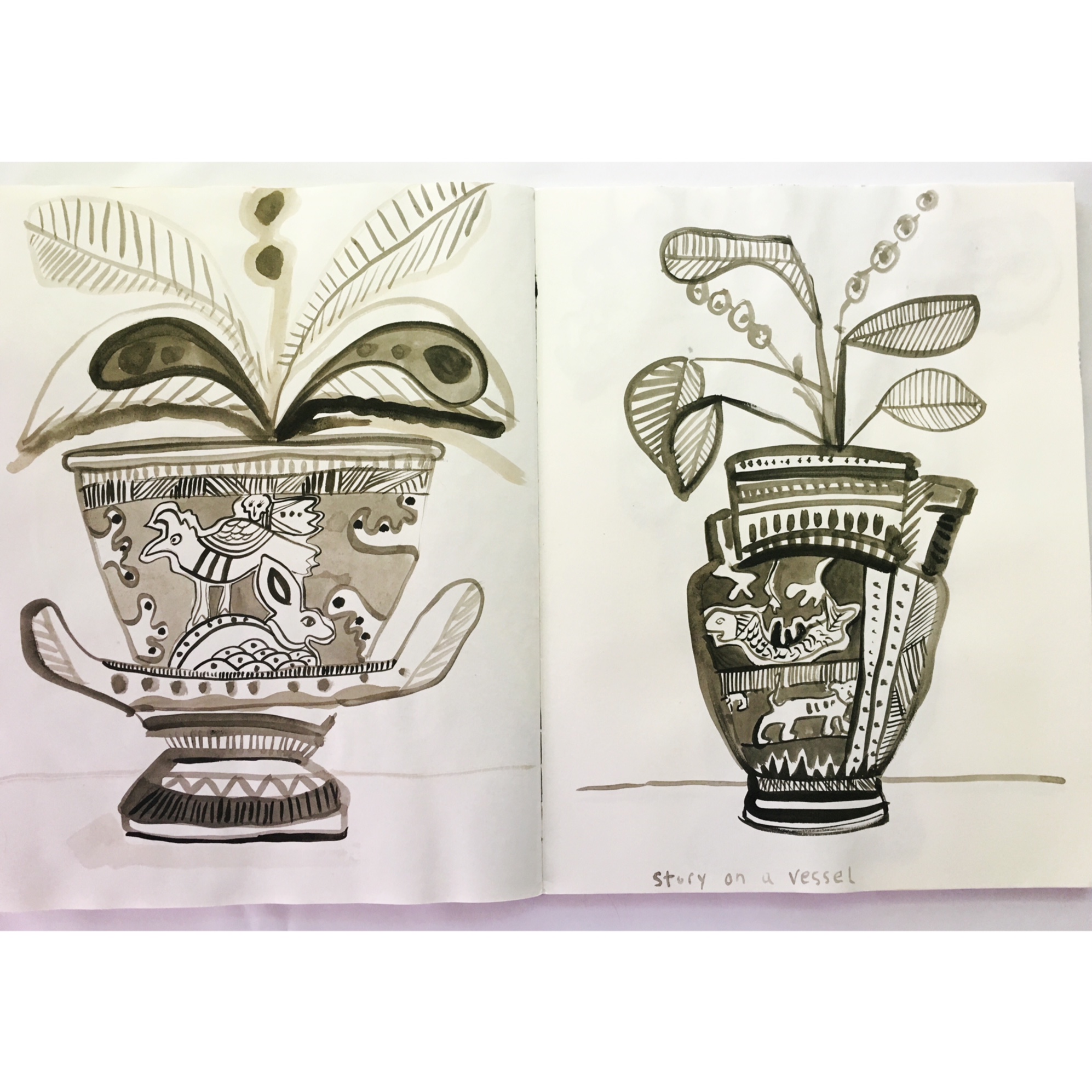
Sketchbook Prompt #5 - monochromatic color
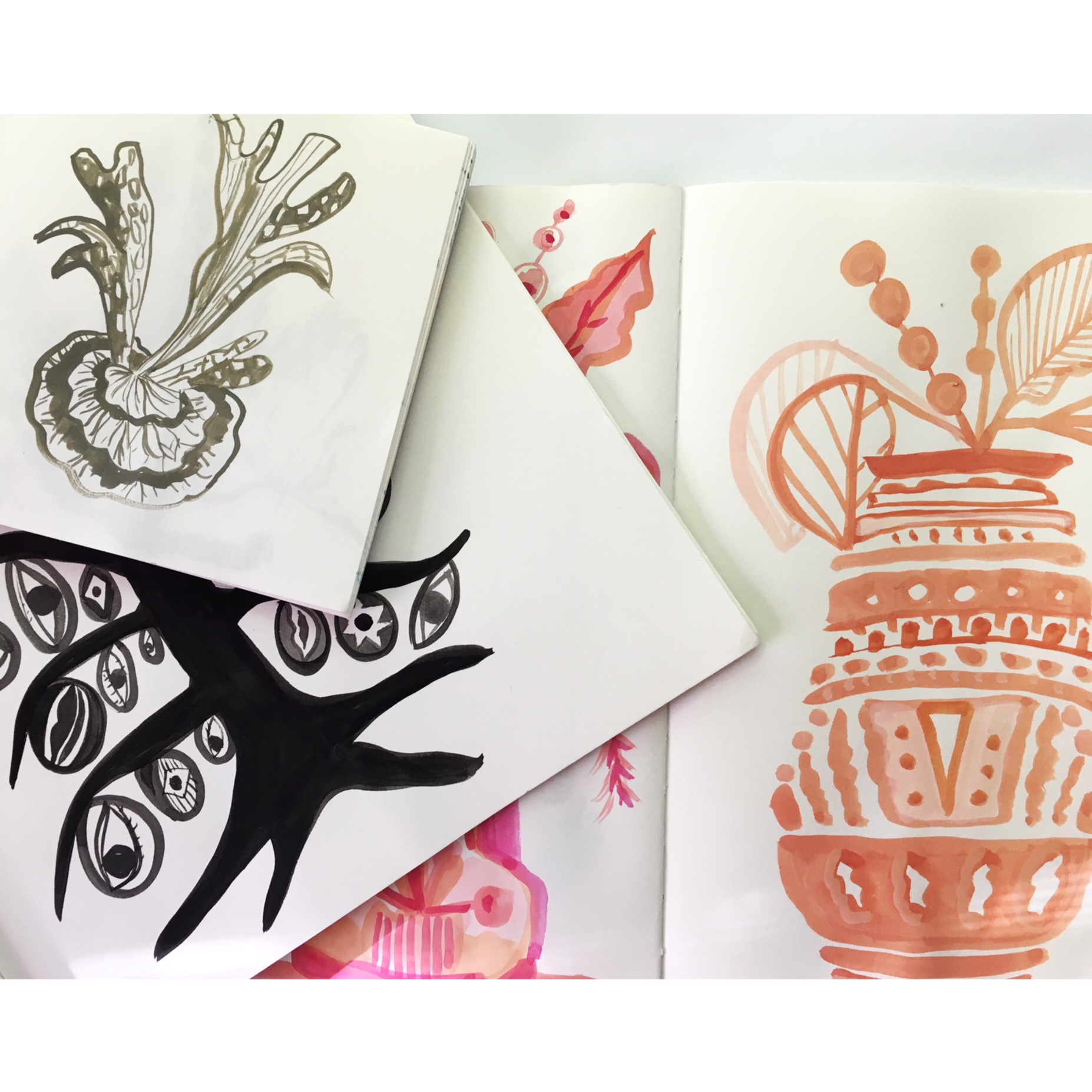
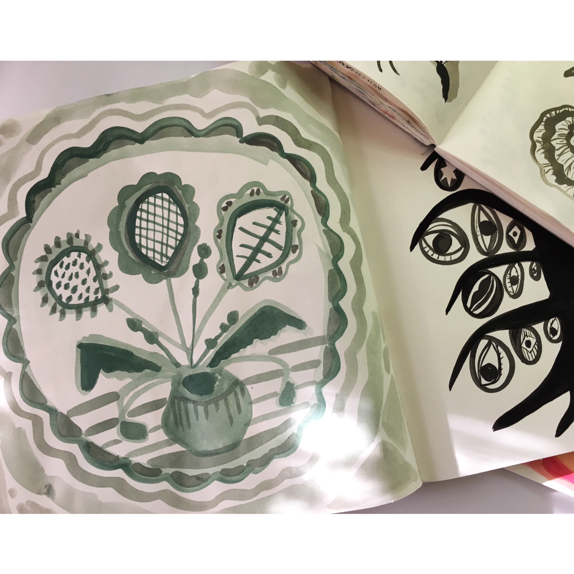
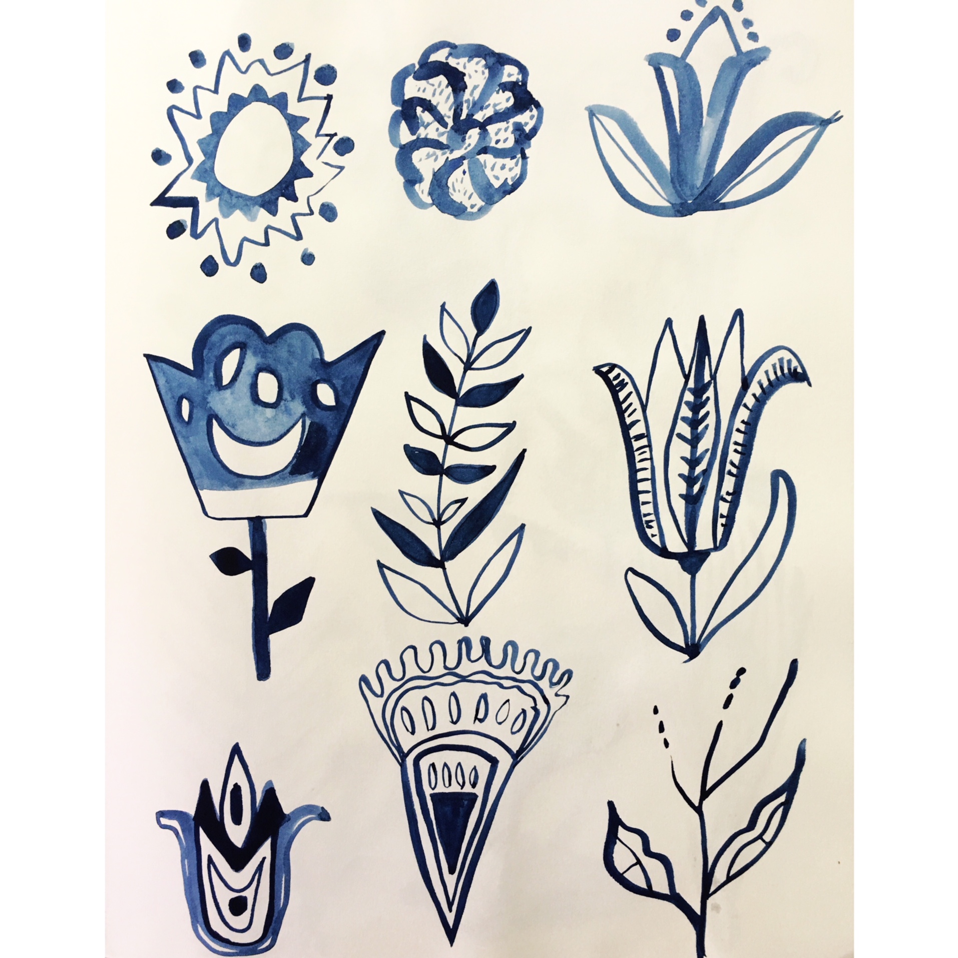
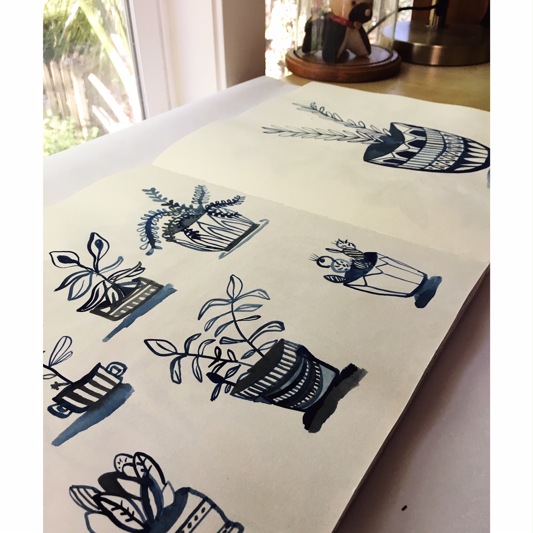
/Sketchbook Prompt #5 - Monochromatic color doesn't need to be boring. When I think of my own work, I don't usually think of monochrome, but I too dabble with monochromatic color for many reasons. Here is a window into my thinking ; 1. being limited in color can be freeing. I say freeing because you don't have to worry about all the other colors, their nuances, how they sit together. You can play up one color and play on the range of lights and darks. 2. limited color allows me to focus on the drawing/painting. Sometimes I want to concentrate on a form, line, pattern, or just focus. Focus doesn't always come easy for me with my rambling thoughts, so this can be helpful too. 3. I often want to see what a color can do, I want to see how it holds shape without any other interferences from other colors. I will often darken the color with a gray #3 or titanium white to see how that changes it. 4. After using the base color, I sometimes like to go back over the drawing/painting with other colors.
Materials;
- sketchbook. My favorite of course is the Kunst and Papier, but it's getting harder to find them. I recommend any book that it's easy to have the pages lay flat and the paper is thick enough for a range of media.
- I use Acrlya gouache, and sometimes Windsor Newton. However, I think whatever range of media you are interested in should be used here.
- brushes if using water based media. I used a size 3 and a size 1 on a lot of these images. I use a sable brush.
- Images to look at. I use photographs, drawings from old how to books, Dover Publications on folk imagery. Anything that gives me some guidance. I often free form it too, but I like having a range of imagery to look at. I also use old sketchbooks to look back on, almost always. I open them up and have them to reference but they also keep me company.
- palette tray
How to get started;
- Select the color. I might use Acryla gray #3, I put a small pinky nail portion down in my palette tray and make at least three different shades from the gray. I water some down more, add a bit of white, and let some of the paint to be thicker. This gives me a range that will be helpful.
- Play, try and let yourself abandon all self loathing here. Play, experiment, try things out, see what happens. My sketchbook is not planned, 80% of it happens from happenstance.
- Try a different color on a an opposing page. I often like to see how images play off of each other. This can be helpful when figuring out what colors to use in the future.